Typography II
This semester I took Typography II at Northeastern University with Ernesto Aparicio, a visiting design professor from the Rhode Island School of Design. The class was a standard studio art class. The class began with general announcements and a short lecture and then the class would transition to individual critiques watched by the rest of the class. The entire course was conducted synchronously online.
Typography II continues Typography I, exploring structures and hierarchies through increasing typographic complexity. Investigates meaning, legibility, and readability with an emphasis on voice, organization, sequence, and the typographic grid. The coursework included four projects, including the short introductory project, and a final presentation. Professor Aparicio made sure to give the class plenty of time within and outside of class with enough of feedback to create work that everyone was proud of.
For the introductory project the class was given a set of information for an announcement. We were tasked with creating the layout for 15 announcements: five samples without applying typographic styles and without changing the size of the typeface—using only the visual space to emphasize the information in the composition, five announcements applying typographic styles, without changing the size of the typeface, and five announcements using styles, scale, hierarchy in a free composition. Like most introductory assignments this was used by the professor to gage where the class is regarding typography and utilization of InDesign. The project as a little boring but I still came up with some layouts that I liked. Below is my favorite from each set.
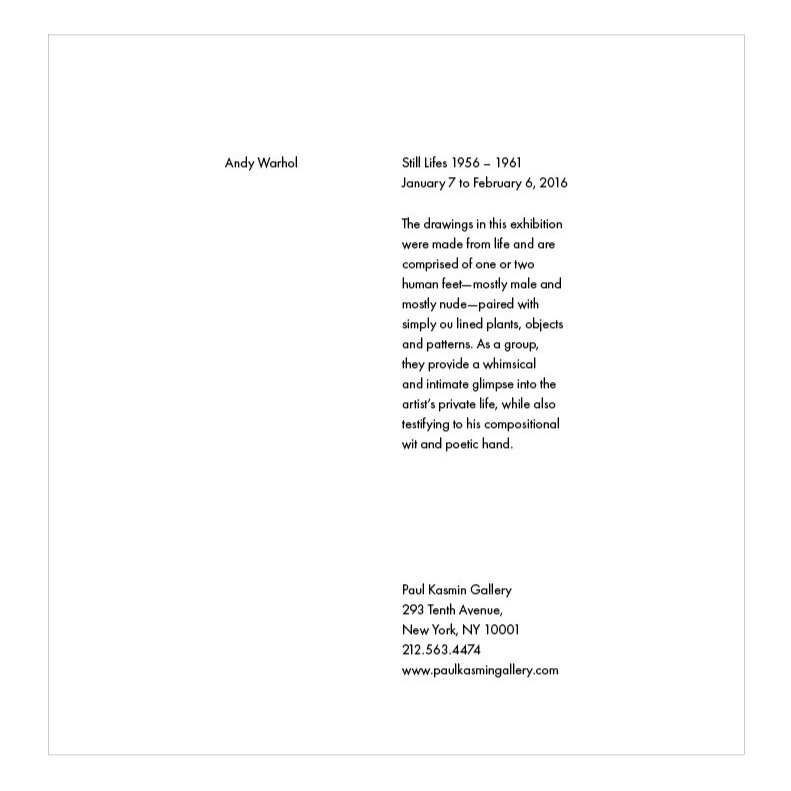
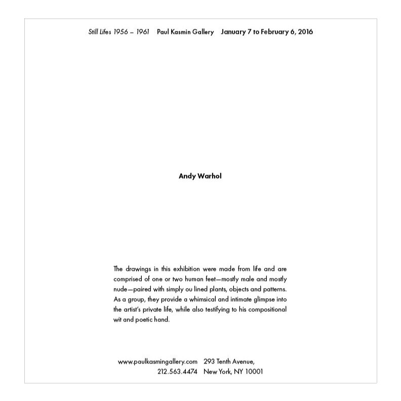
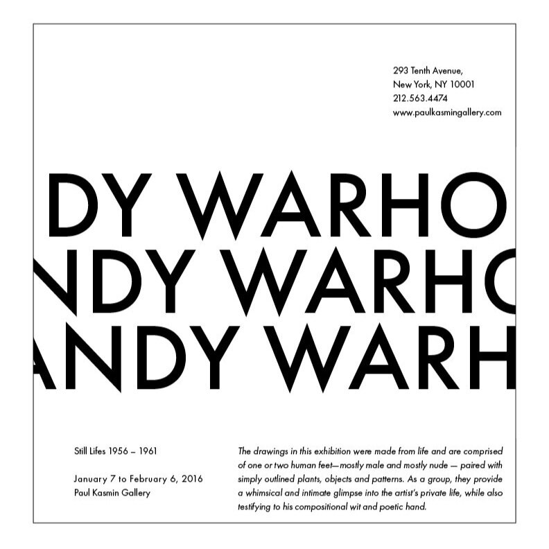
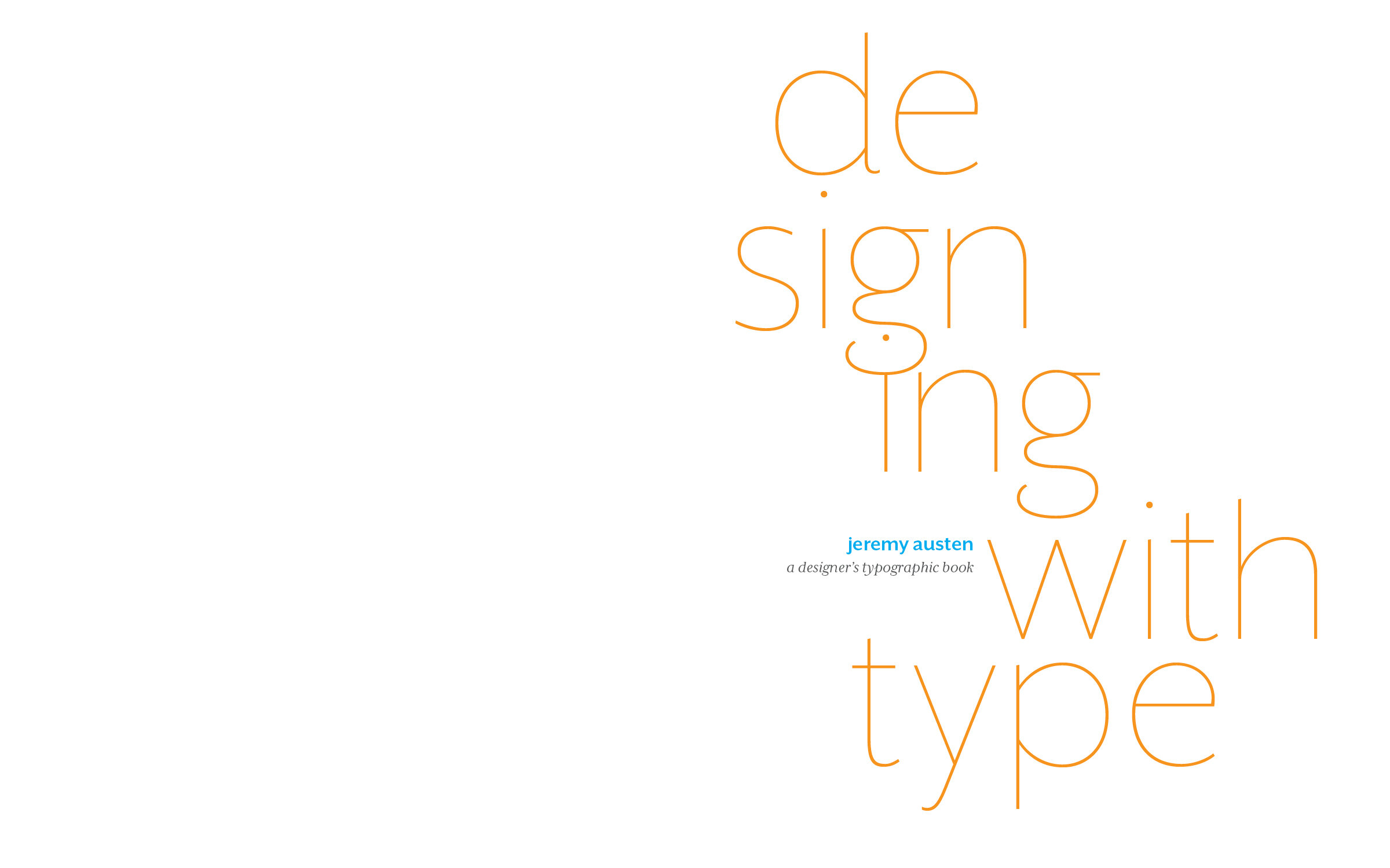
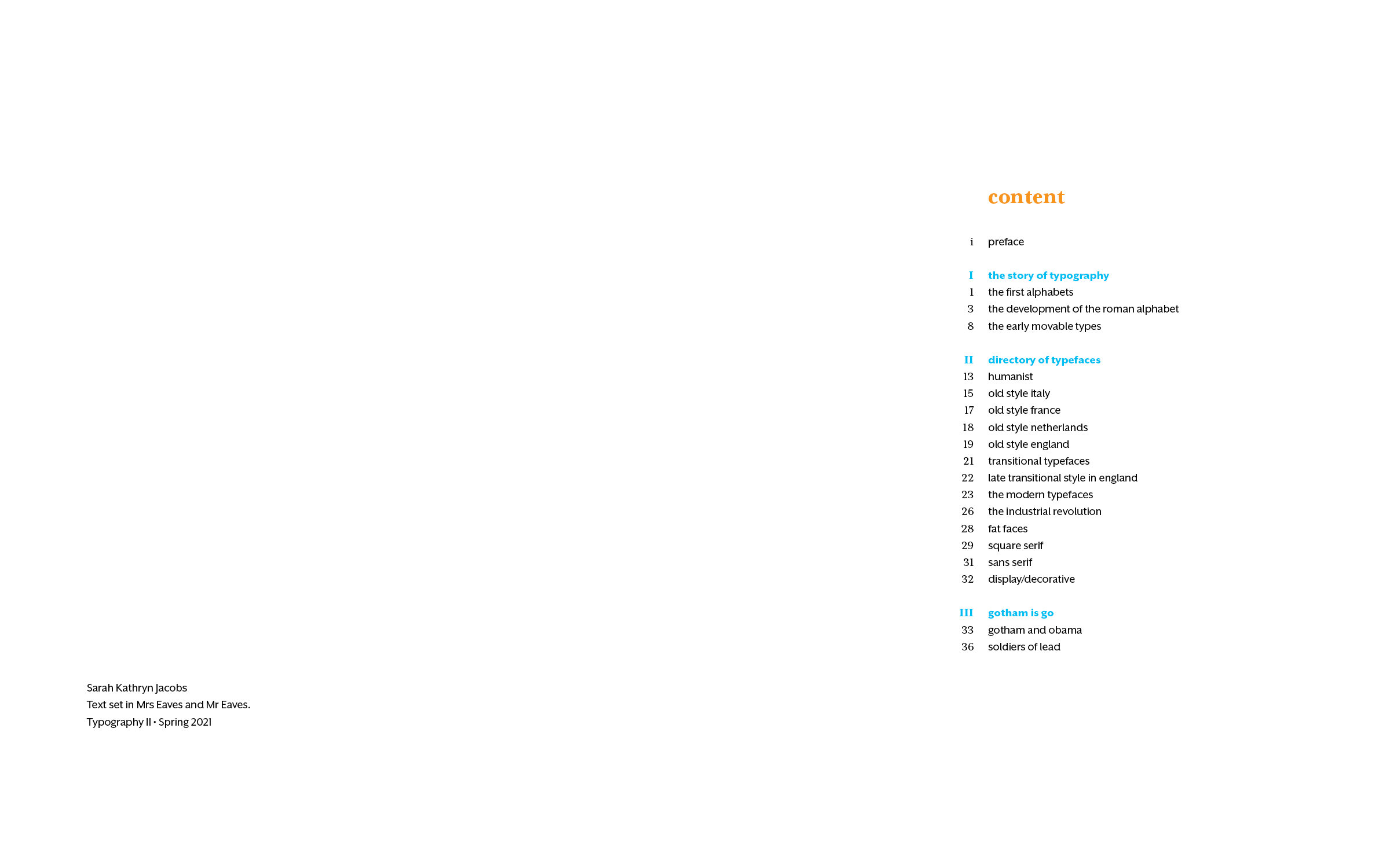
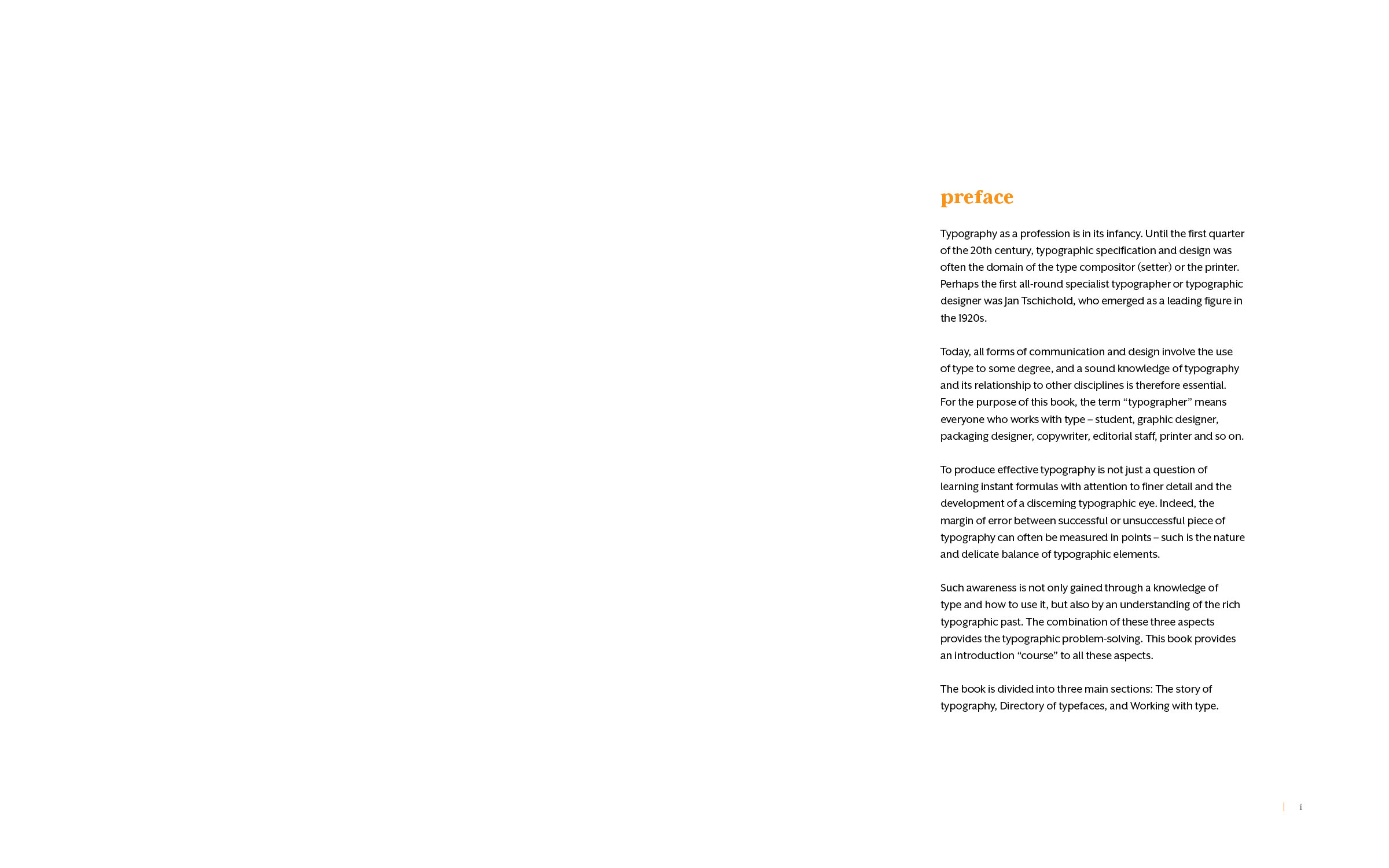
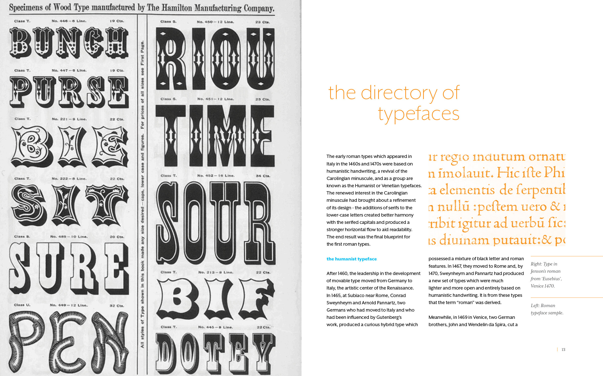
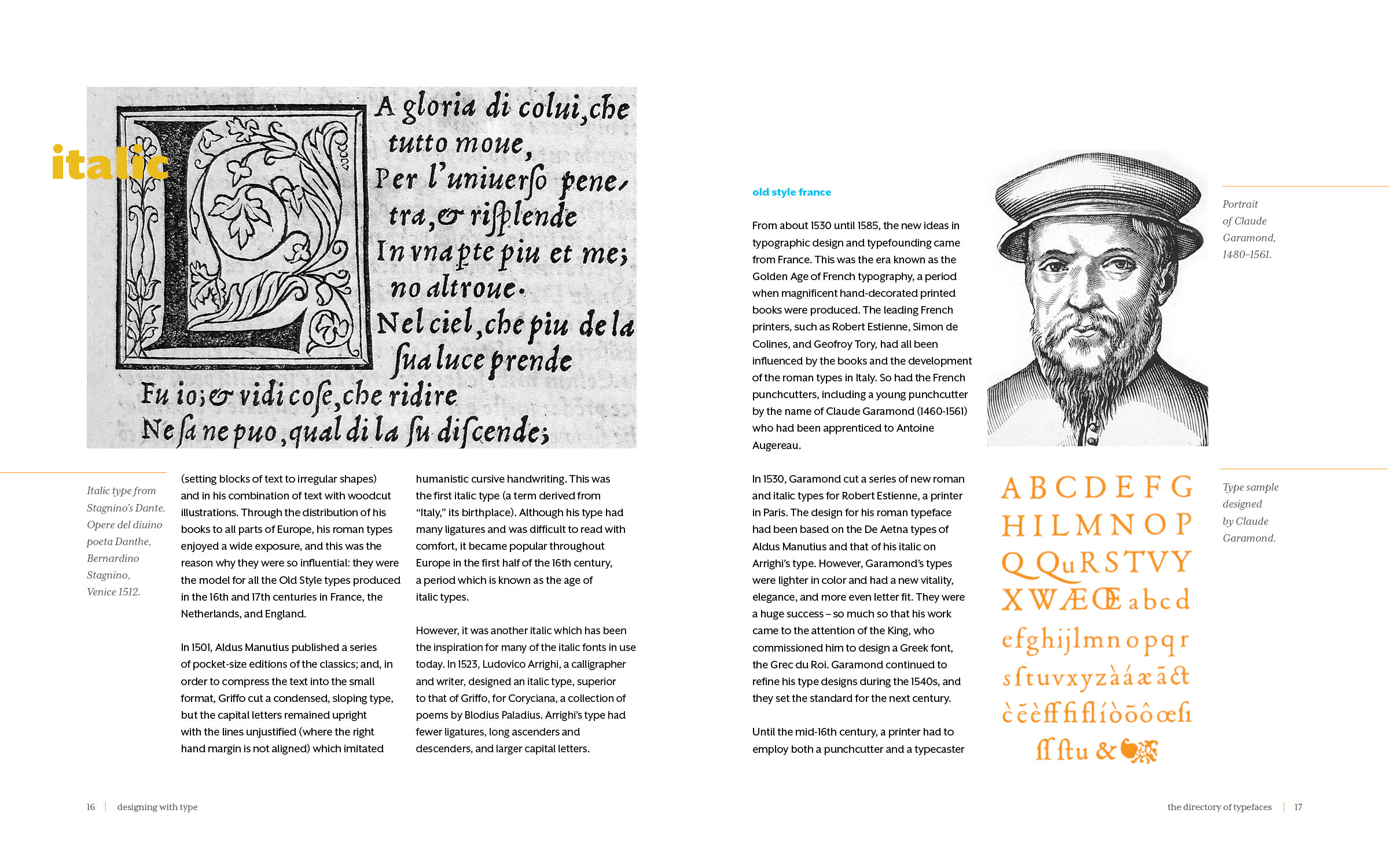
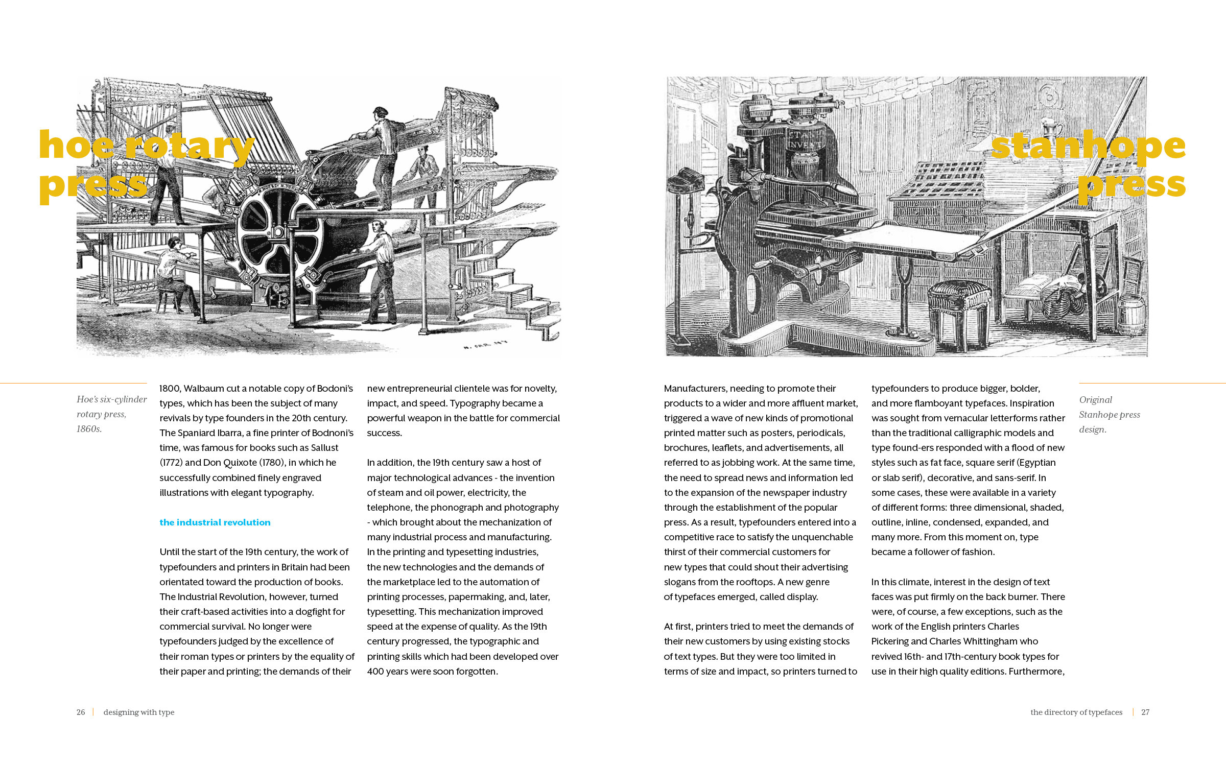
After a round of revisions for the introductory assignment, the class moved into the second assignment. The second assignment was a book design project in which we designed the layout of three chapters and the corresponding dust jacket for a book about typography. We were given the text by the instructor and we chose the Iconographic material and the respective captions for the three chapters.

The Book was titled “Designing with Type” by Jeremy Austen and consisted of an preface and three chapters all about the history of typography. Each of our books contained a half a page title, full title page, dedication, table of contents, preface, page headers, chapter headings, and subtitles. I was a little skeptical of how everyone in the class could create their own unique book from the exact same material. However, that thought dissipated by the first critique. Looking at the different approach everyone took, even with the first three layouts, was astonishing. Over the next few weeks we polished our layouts and covers to create our final books. This project was all about attention to detail and subtle design. For the first three weeks of the project I did not add a single piece of color because I was painstakingly manipulating the photos to ensure there were no widows, orphans, weird hyphenated words. Below are a few pages from the book.
While we were completing the Book Design project, we started Assignment 3. This project was all about information design. The class was given a list of topics to choose from. I combined the Food and Energy topics for my poster. This semester I was also taking Information Design I with Thomas Starr. I particularly enjoyed this project because it allowed me to utilize the skills I was learning in both of my design courses as well as my knowledge and passion for the environment. Below is my finalized poster “Food and Energy.”

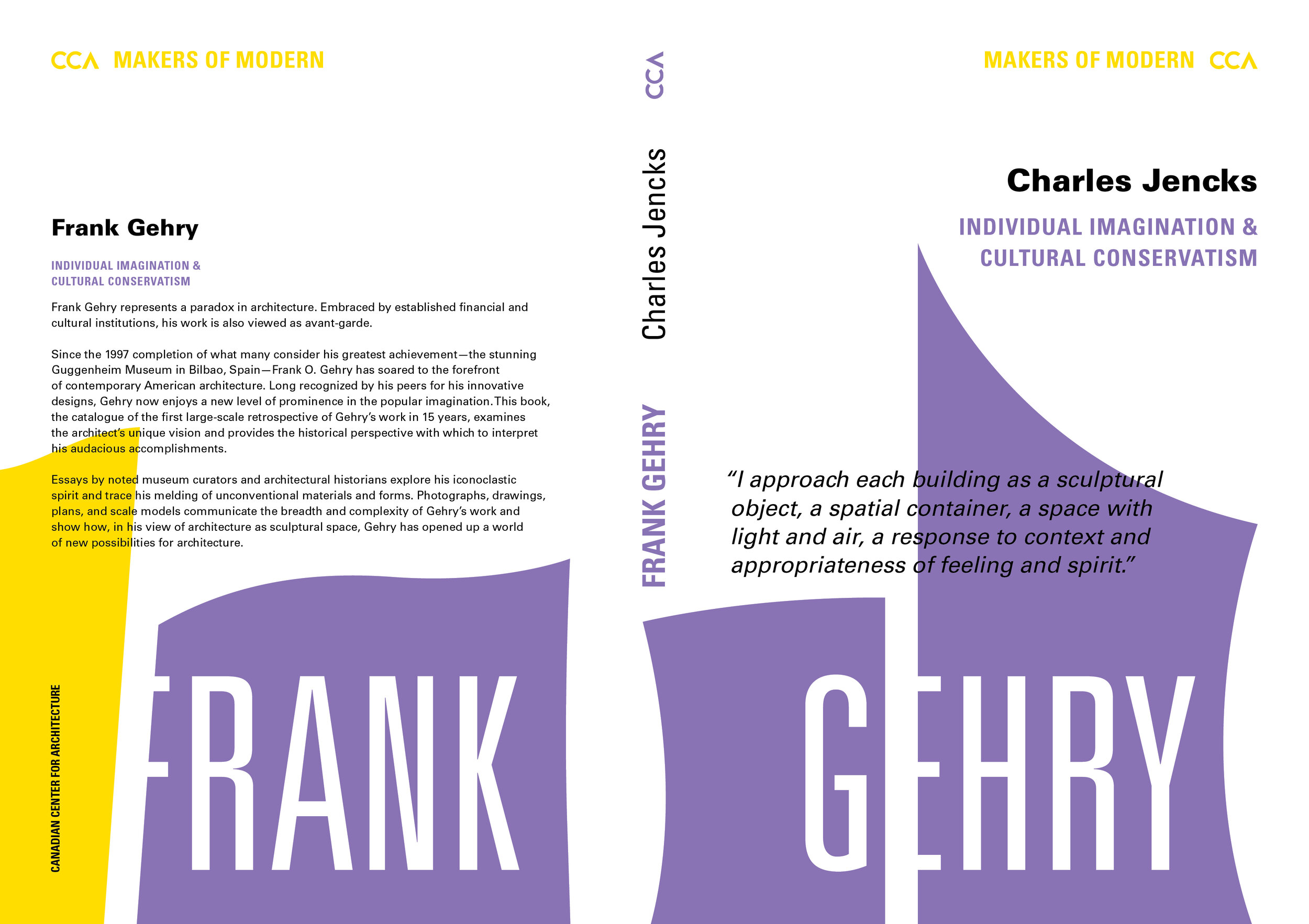
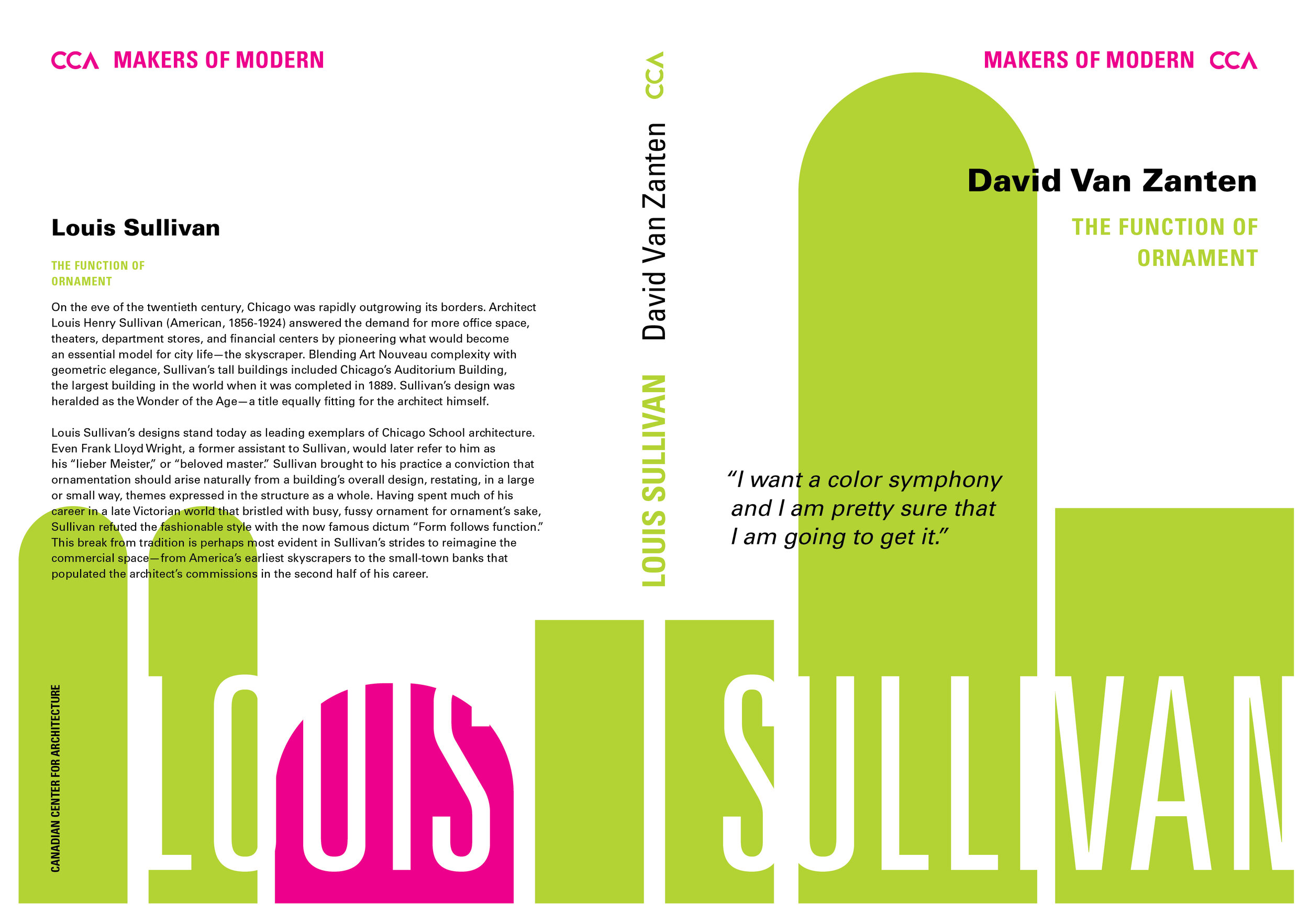
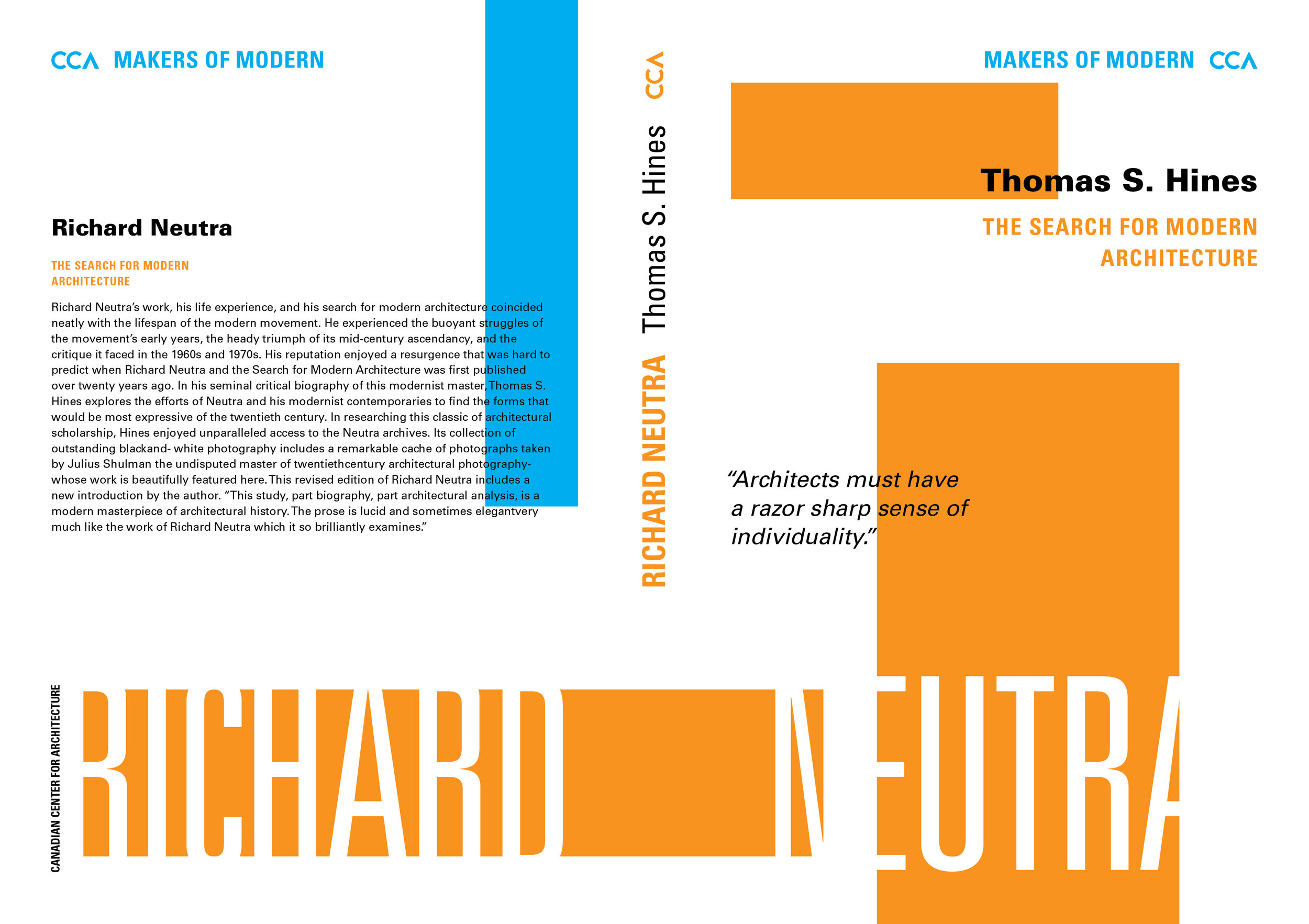
The last big project for the course focused on Typography and Systems. We created book covers for the CCA (Canadian Center for Architecture, Montreal) about three architects whose works represent three distinct styles and movements: Louis Sullivan (Chicago style, influenced by Art Nouveau); Richard Neutra (Modernism); Frank Gehry (Decon-structivism). The covers had to be individually designed but work together as a cohesive system. I loved this last project because I felt that it was the ultimate culmination of everything I had learned in the course and I am very pleased with the way the project turned out.
For our final presentations each student picked a Typographer or Graphic Designer to showcase in a keynote presentation. Each student was required to research their chosen designer and create a visually appealing and typographically flawless presentation. For my project I chose John Roshell and Swell Type so I could introduce the class to Comic Book Lettering and the typographic work I have done in my time working there.

This semester was extremely difficult for me. During this pandemic year I have been struggling with extreme exhaustion which has made it difficult to feel motivated to work. This semester I was also overloaded with work as I was taking two studio design courses, a communication writing intensive, my genetics and lab requirement, searching for a co-op, working for Campus Recreation as a designer and instructor, working for Swell Type, and attempting to get involved with clubs on campus. Even with my overload of work I am so proud of what I accomplished in this course. I have grown so much as a designer and I cannot wait for what it next.