Information Design I
This semester I took Information Design I with Thomas Starr, a design professor at Northeastern University. The course introduces basic concepts, methods, and procedures of information design with a focus on mapping information. Students investigate visual systems and information structures such as maps, graphs, charts, and diagrams. An emphasis is placed on the creative process of organizing, visualizing, and communicating data by making complex information easier to understand and use.
I was excited to take this course because information design is something I have always been interested in, especially because it is very crucial to displaying data in science. Although, to take this course one must complete Graphic Design I & II and Typography I & II. I took Graphic Design I and Typography I last semester and Took Typography II this semester and Professor Starr made an exception for me to take this course. Thus, I was apprehensive to take such a high level design course that I was not qualified for. This made me work extra hard in this course to keep up with the class. I ended up enjoying the class a lot. Professor Starr was able to facilitate a great learning environment filled with collaboration even though the course was held over Zoom.
In the course we did in introduction assignment, three full assignments, two in class assignments, and submitted three writing assignments. For the introduction assignment we asked a few unrelated questions to our peers and created a graphic to represent the data.

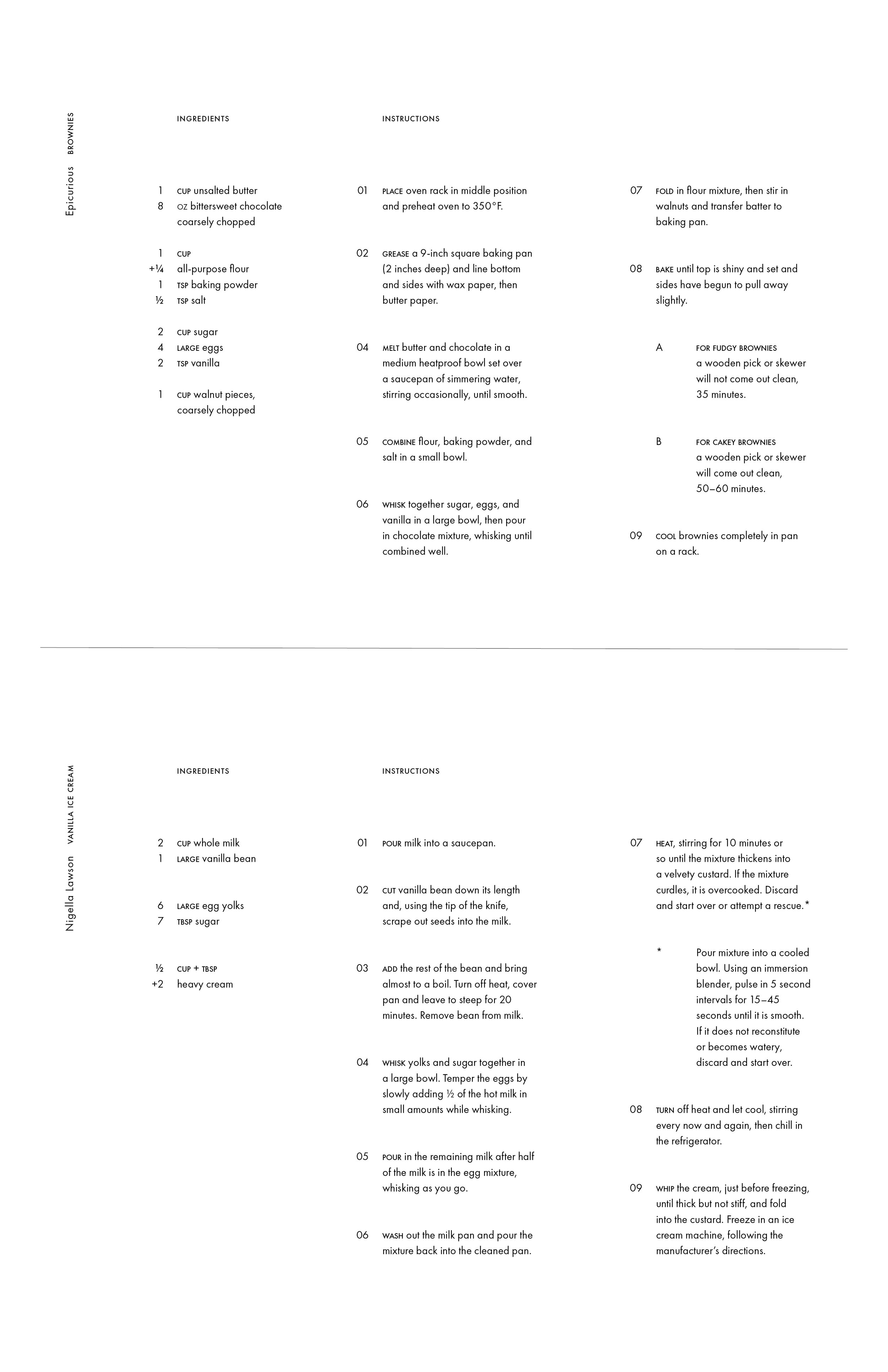
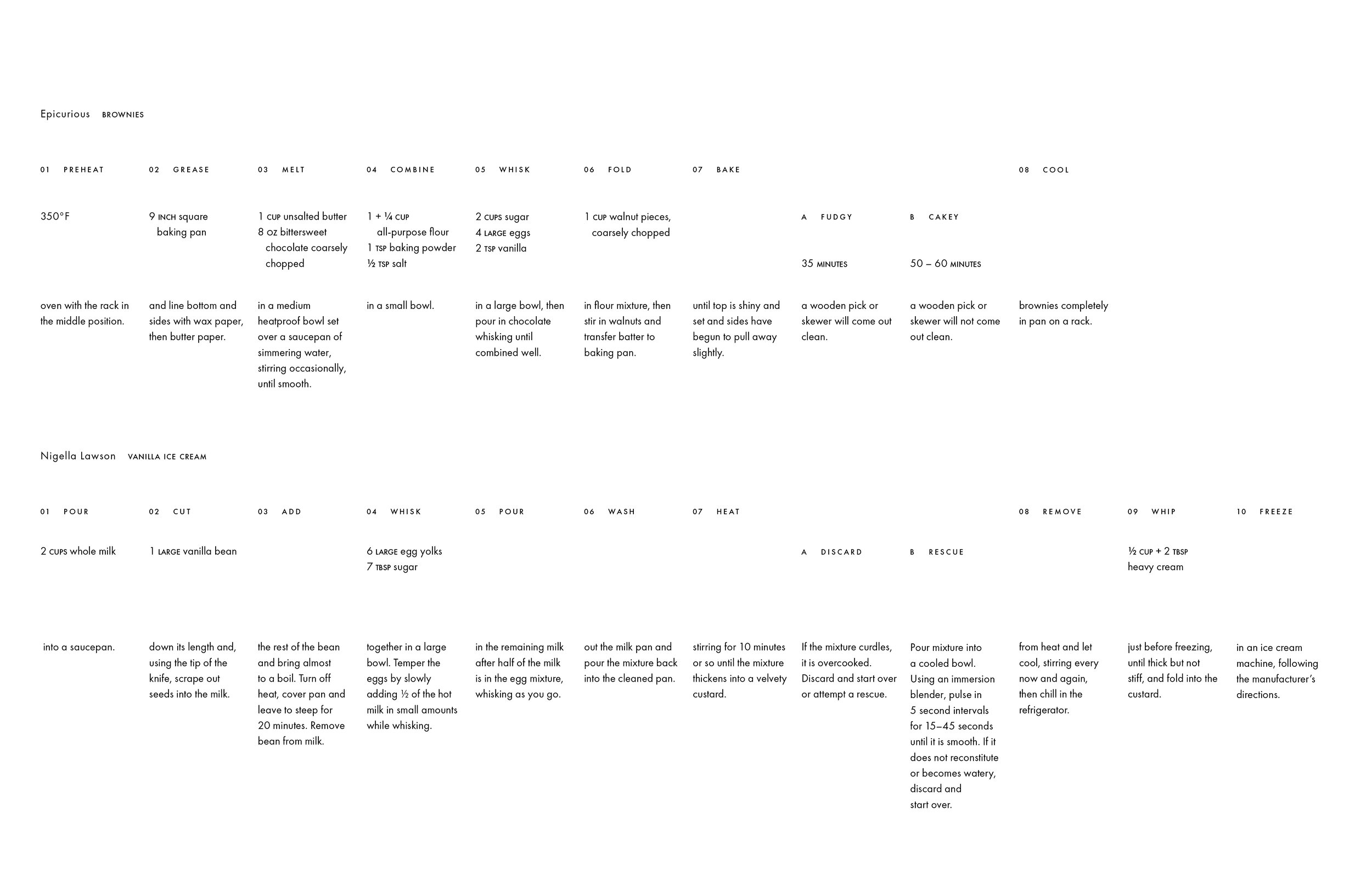
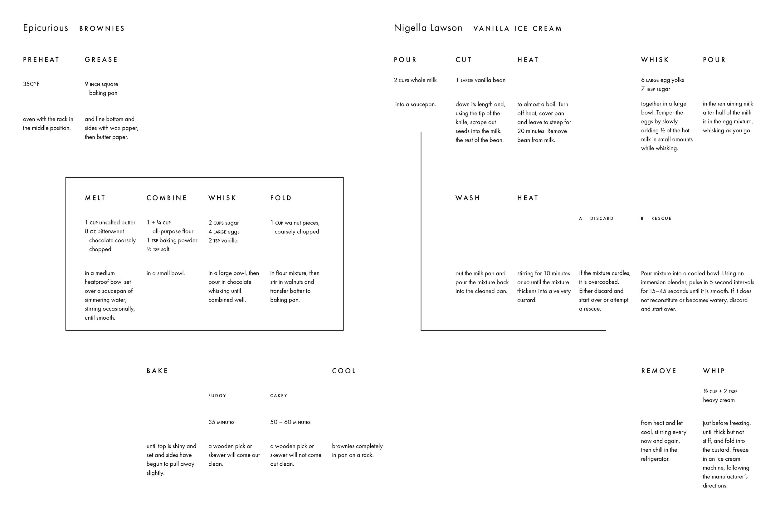
The assignment was to take a set of two recipes and format them in various ways. The first week we created eight versions of each recipe. In the following weeks we explored how to manipulate the type to create various layouts of the recipes incorporating the difficult steps and ingredients together. For the final submission we each had three versions. One version was supposed to use only one typeface and size, one version was meant to display time, and the last version was supposed to be more diagrammatic.
For the second assignment each student chose to watch one film on a list we were provided. Each film incorporated time in a unique manner. The film I chose was “The Hours.” The film follows three women in different time periods through an important day in their lives. Each of their stores follows a similar arc and the characters are each connected through the book “Mrs. Dalloway.” This was an extremely difficult project, I took a lot of time deciding on what was the best way to represent the timeline of the film. I ended up displaying the plot as a clock. The times on the clock represent the various events in the day that are similar for each character and the hands represent the relationship of each character to the book.

The third and final assignment for the course was to find a data archive and display the data to illustrate trends. I picked the National Parks as my data set. My immediate thought was to display the parks with circles corresponding to their size and visitorship in their geographic region of the country. Over many weeks and iterations I ended up displaying them in a venn diagram of biomes with a region map and listing according to visitorship with size and acres on the side.

Information Design I was a challenging course. Professor Starr tends to be vague with project descriptions which pushes the class to come up with extremely unique projects.