Typography I
Fall 2020 I took Typography 1 with José Menéndez at Northeastern University. This course is a design requirement for my major in Communications and Graphic and Information Design.
Going into this semester I was overall apprehensive because of the Coronavirus Pandemic but Typography 1 with José Menéndez made me excited to start classes again. In the spring of 2020 I took Design Process Context and Systems with José and loved it. I learned a lot and José made the transition to remote learning seamless. I felt like I was creating work that I was proud of and connected with the other students in the class. I was also excited to learn more about typography because I have a background in lettering and type design in the new course.
The first couple studios of Typography 1 went over the history and functions of type in society. Our first assignment was to analyze form and counter-form by overlapping letters and create up to 10 unique lettercropping compositions. I took a rather simplistic approach to the assignment using Times New Roman and Helvetica.


I wanted to show the intricacy of the two typefaces and how just 6 letters of two typefaces could create so many interesting moments. I then took the assignment one step further: I created a gif of the elements colliding and separating into their original form.
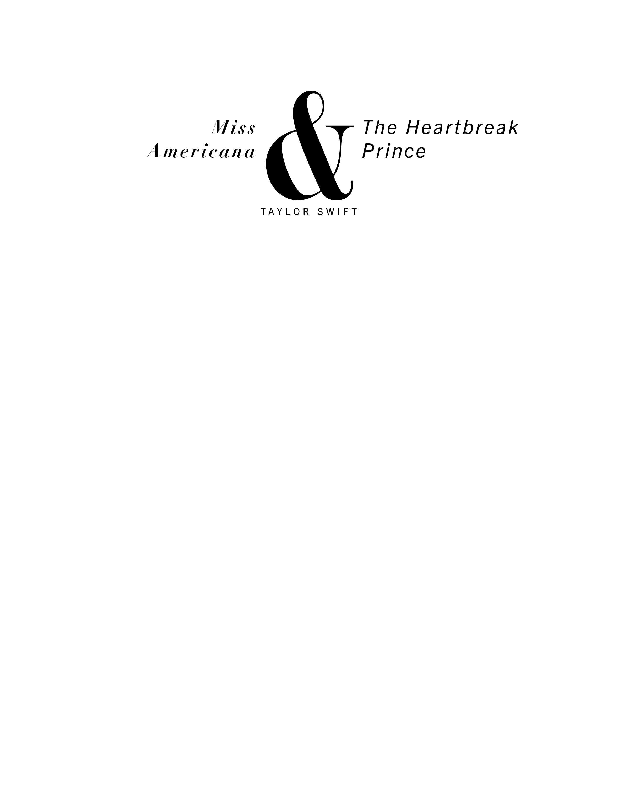
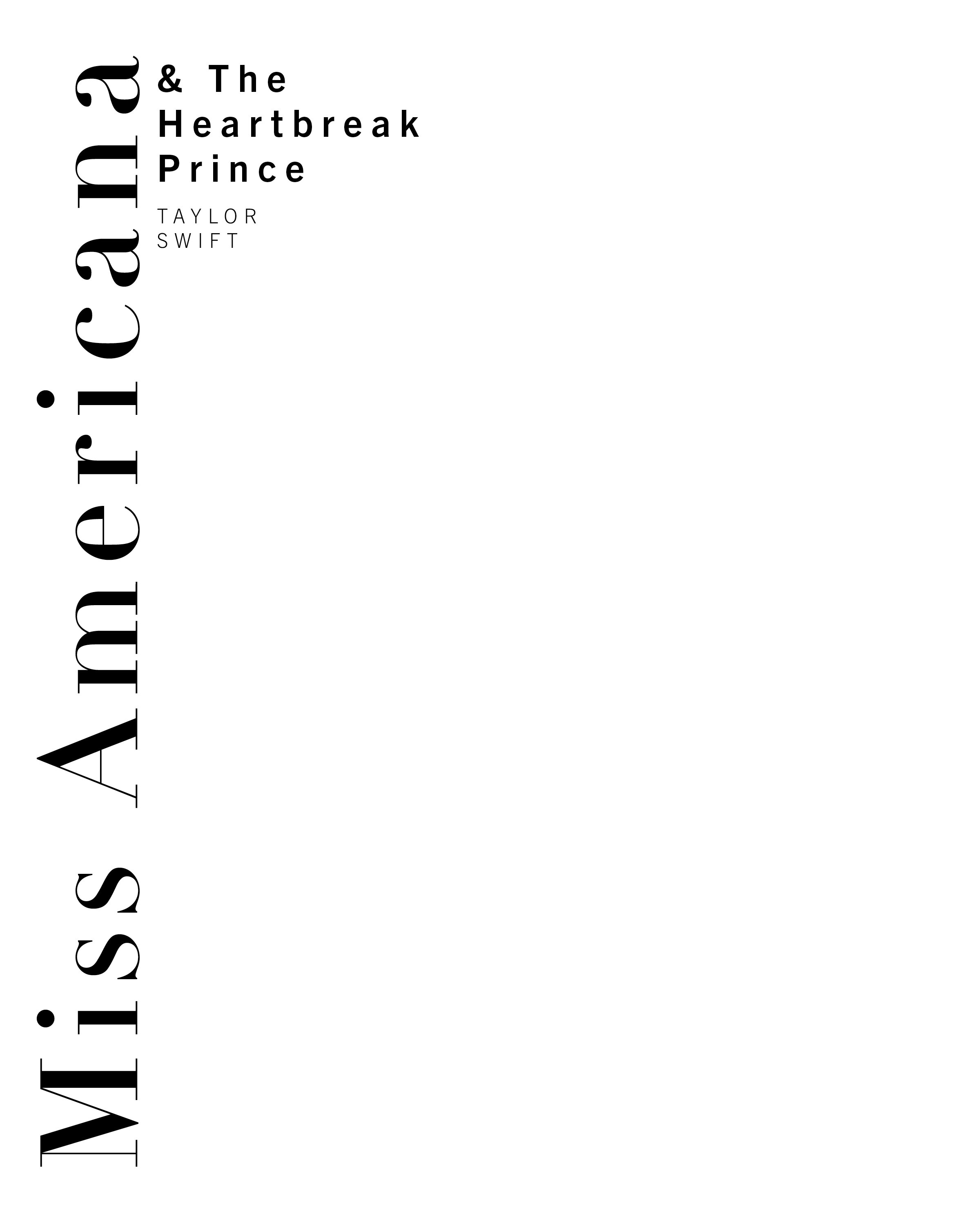
For the next assignment we were tasked with choosing one or two typefaces from one type foundry and creating an educational postcard set or set of instagram posts. I started out with the idea of creating 6 individual instagram posts that would align together to create a poster. I chose Mrs. Eaves by Zuzana Licko. A serif typeface based on Baskerville that I soon fell in love with.
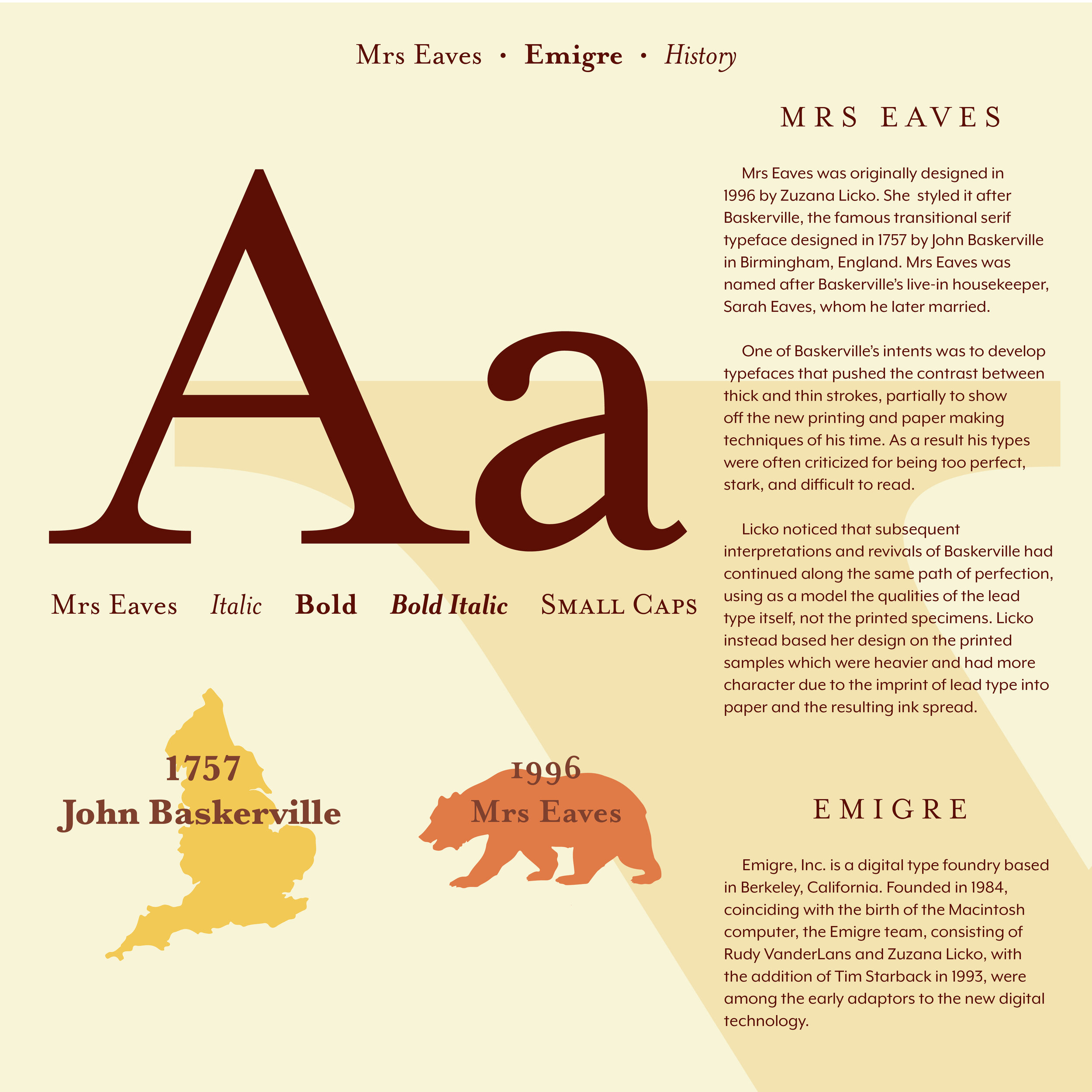
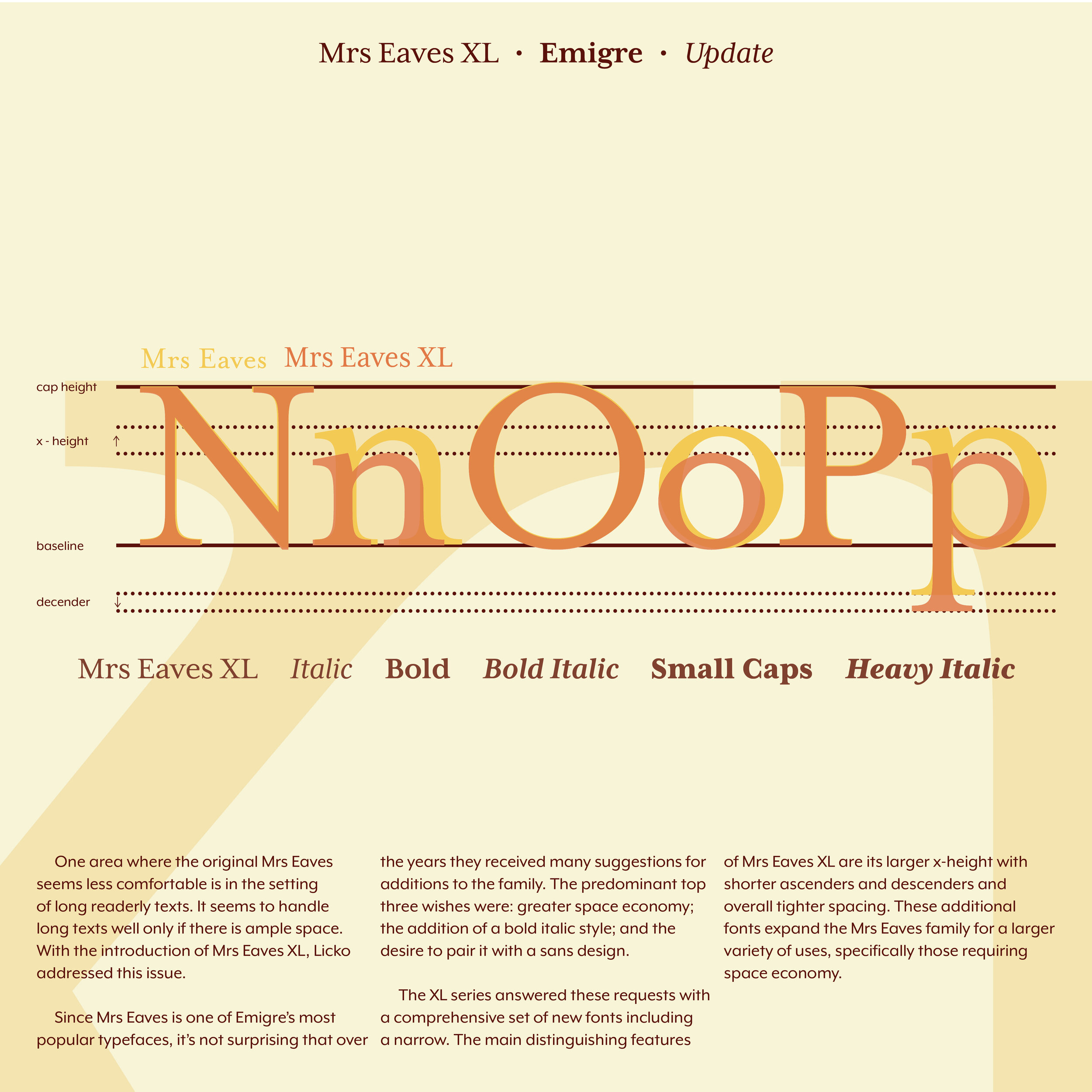
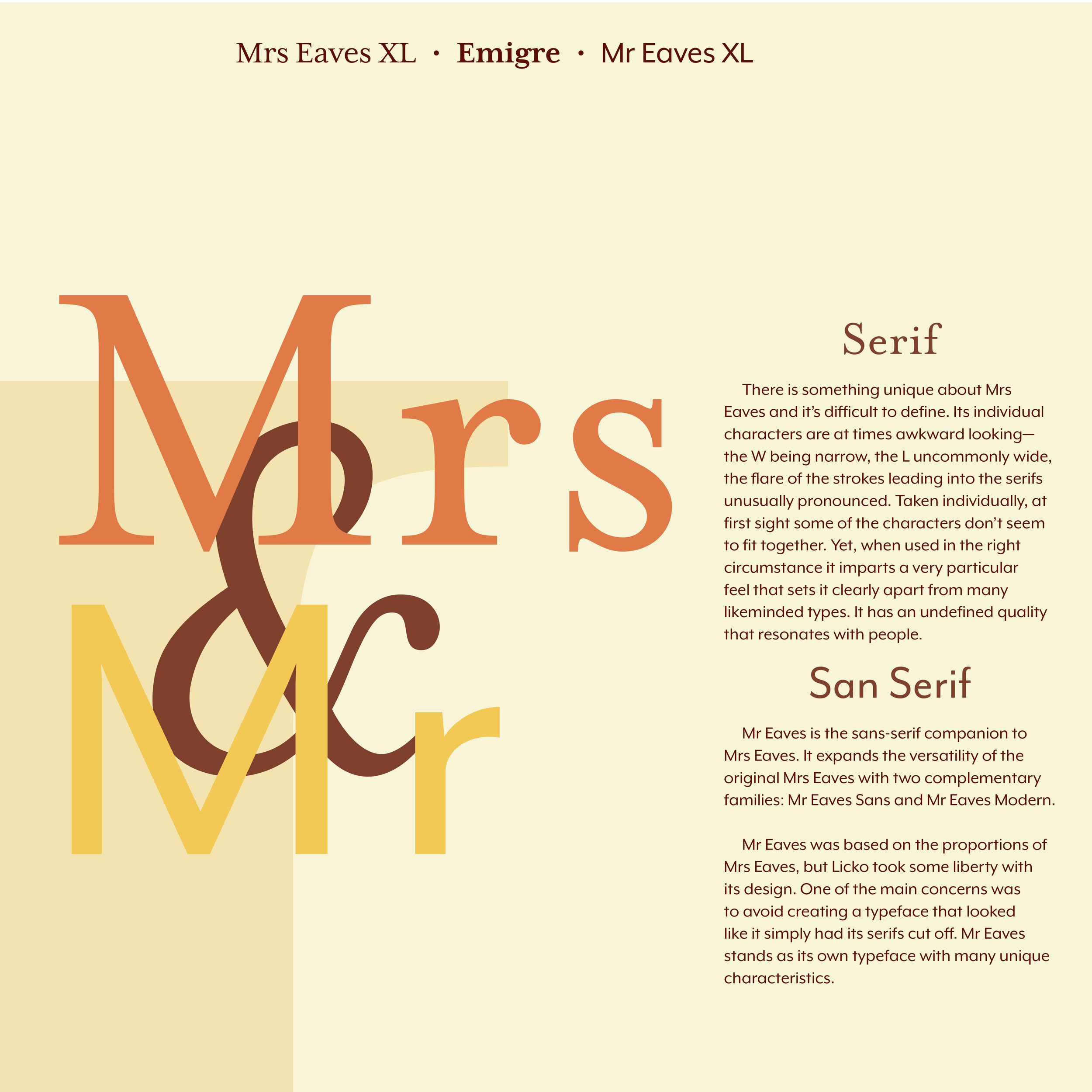
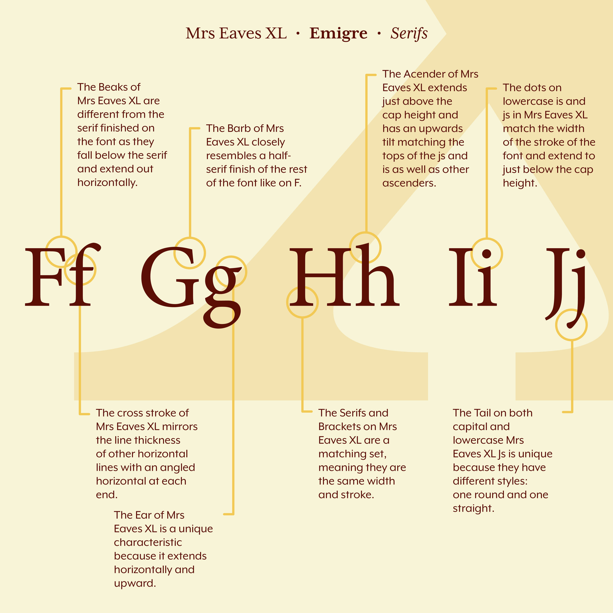
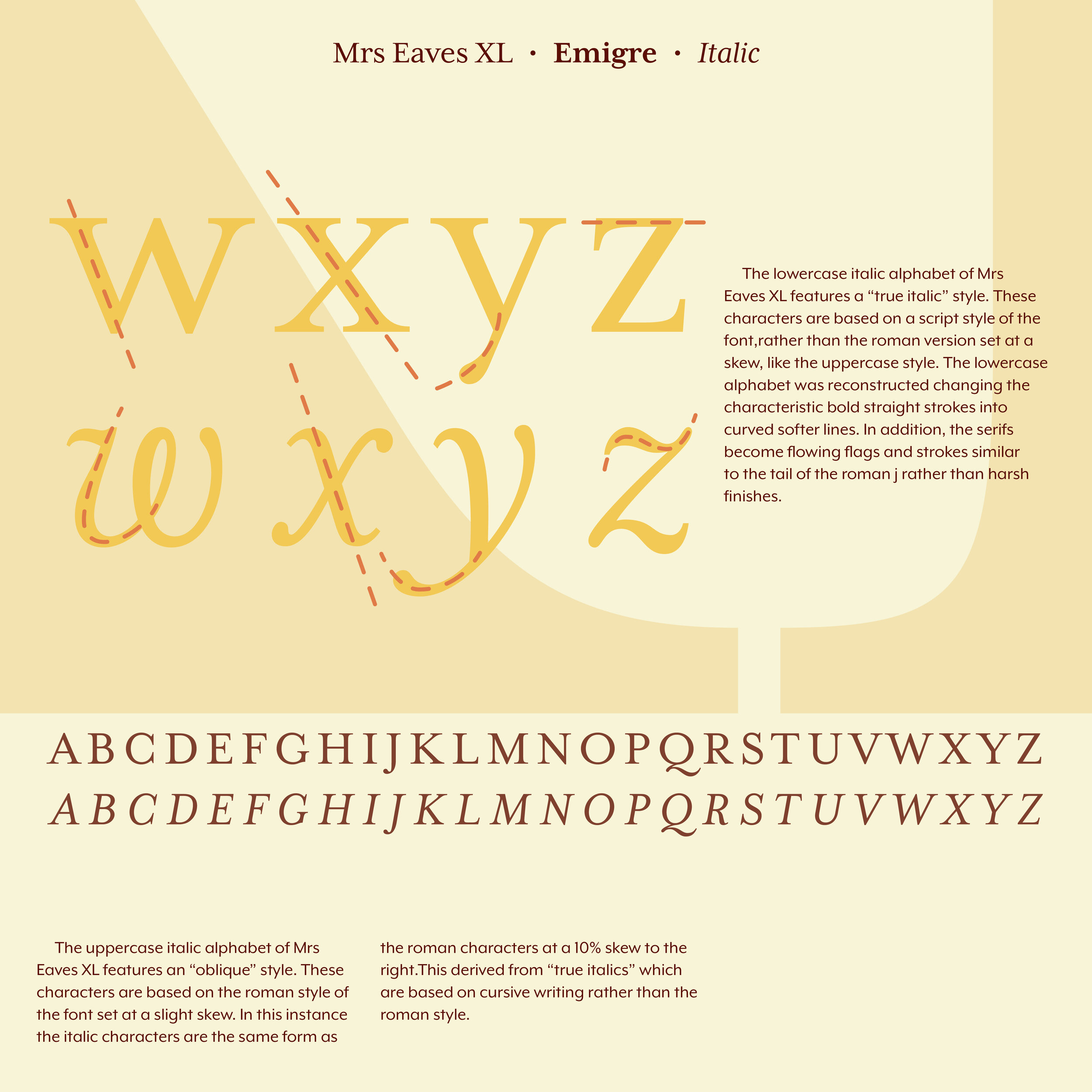
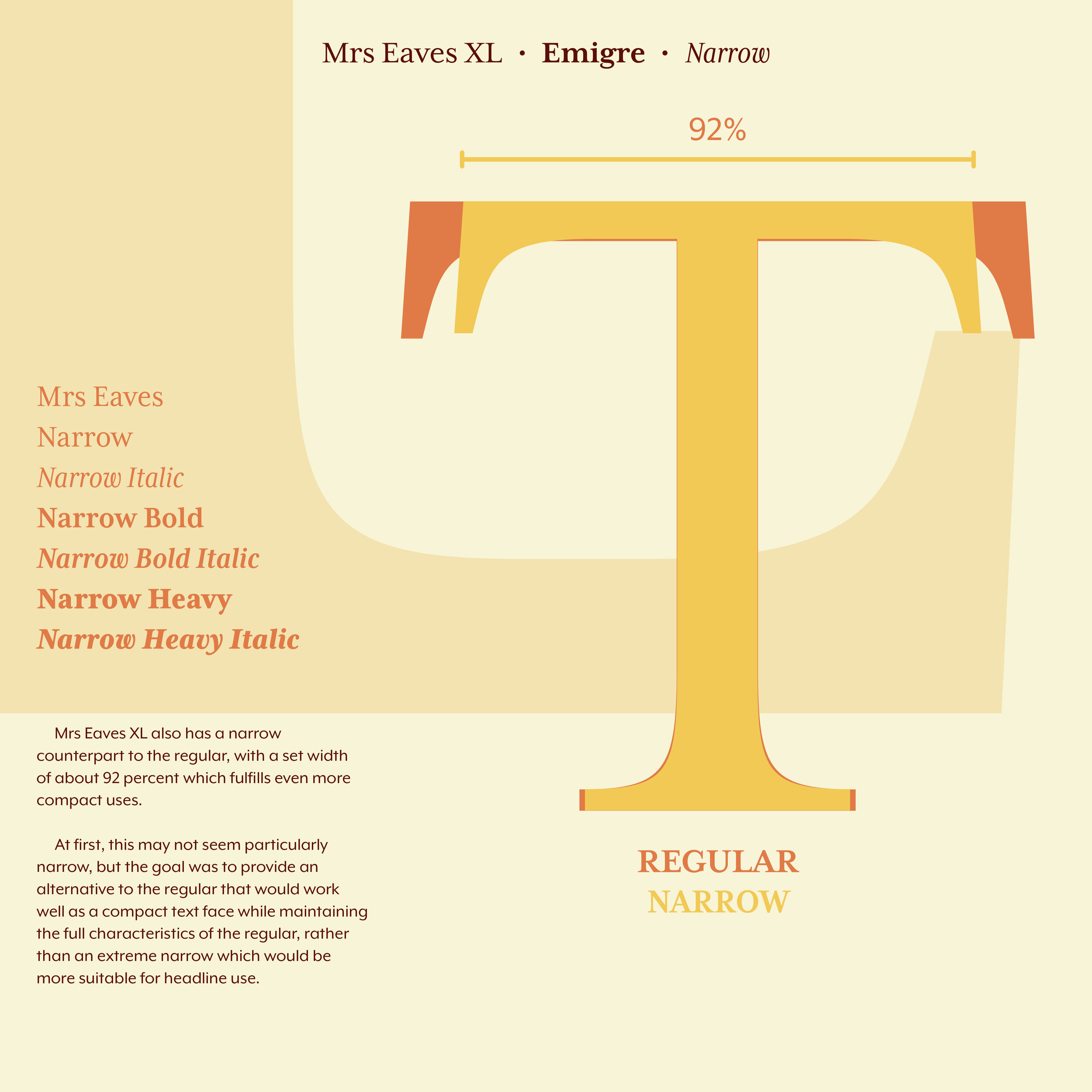
I was extremely happy with the way the posts turned out. I went into the final critique very happy with what I had made. Then, as I watched everyone else present, I decided I had not done enough. Everyone else had more and better. I scrambled and came up with an additional idea to make the posts postcards as well. The postcards would come in a set that had a front and back cover, the backs of the postcards would line up as well. Amazingly, I created the front and back cover during class and uploaded it to the drive before I was up.
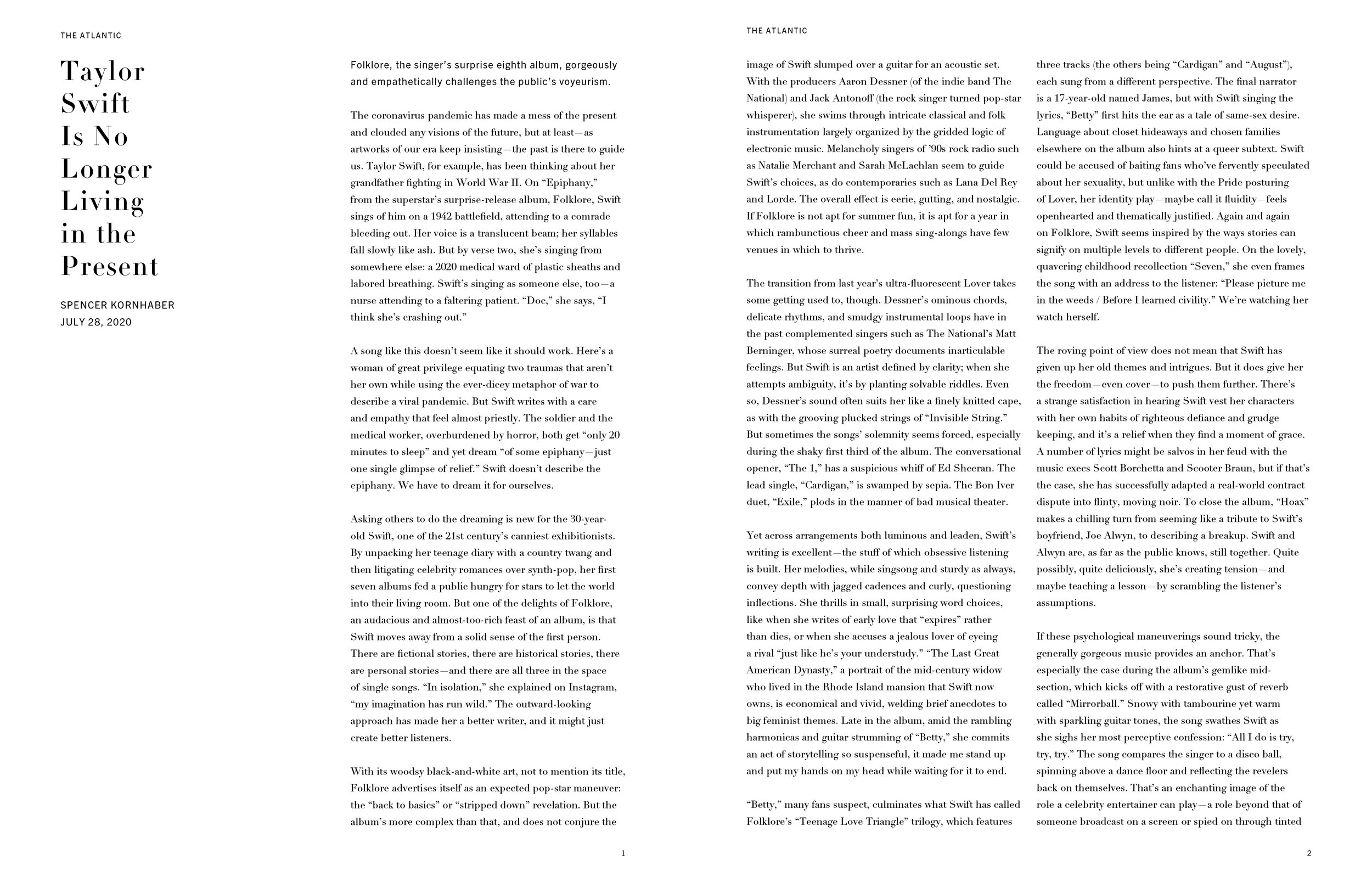
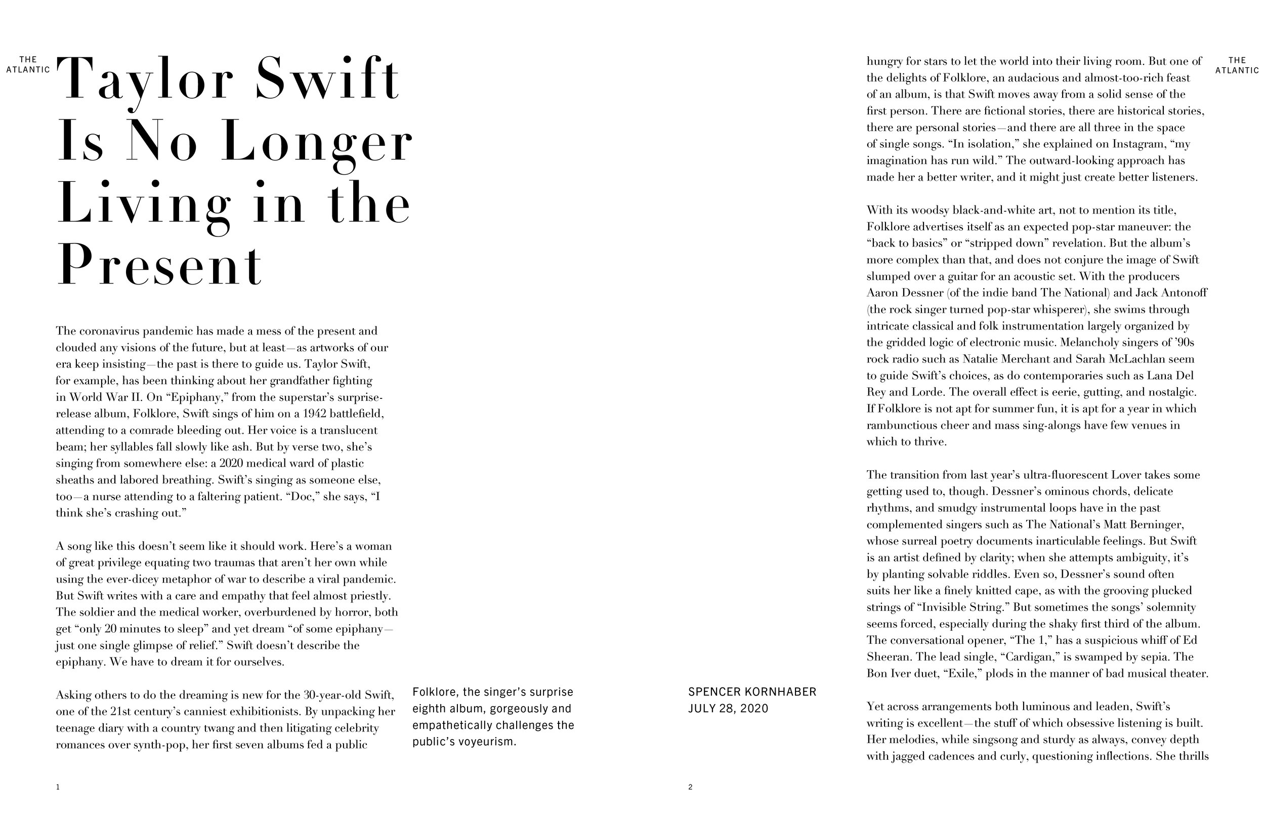
After the postcards project we moved onto two typesetting assignments. For the first we took a headline or sentence and use Placement, Layout, Size, Weight, Motion, Alignment, Hierarchy, Texture, and Density to arrange the type.
Then, we took. headline and article and used different grids and type settings to create various compositions.
The typesetting assignments were supposed to promote exploration of the aspects of type and how to use it. After the typesetting assignments the class moved onto a quick project before the final assignment. We were tasked with creating new and better vote stickers. Now I love designing stickers so I had a blast coming up with a fun sticker pack that would hopefully get people excited about voting.

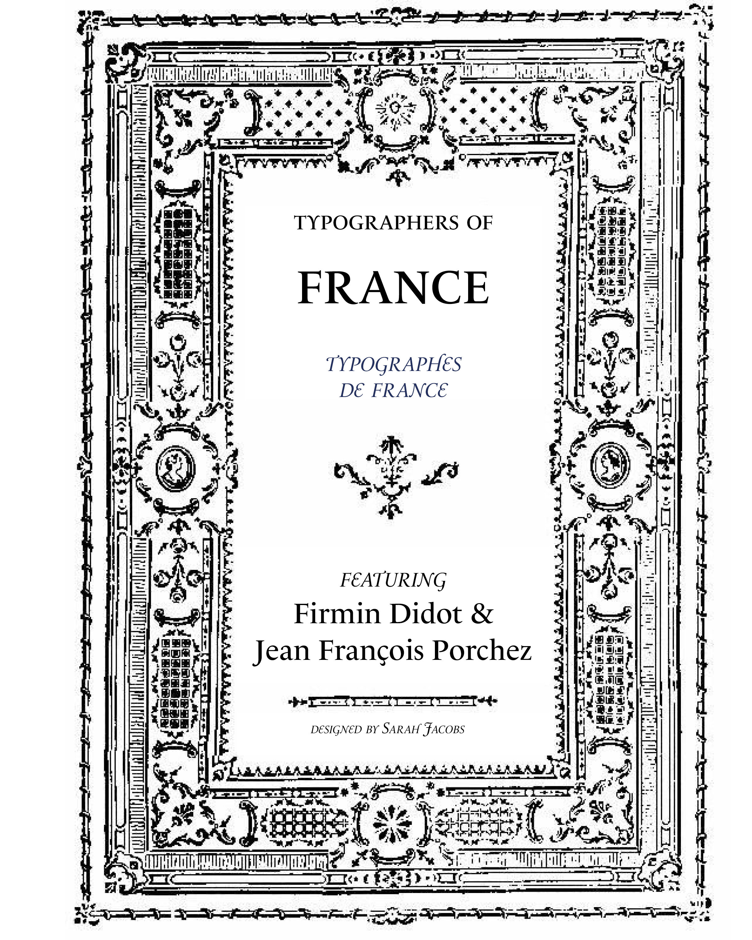
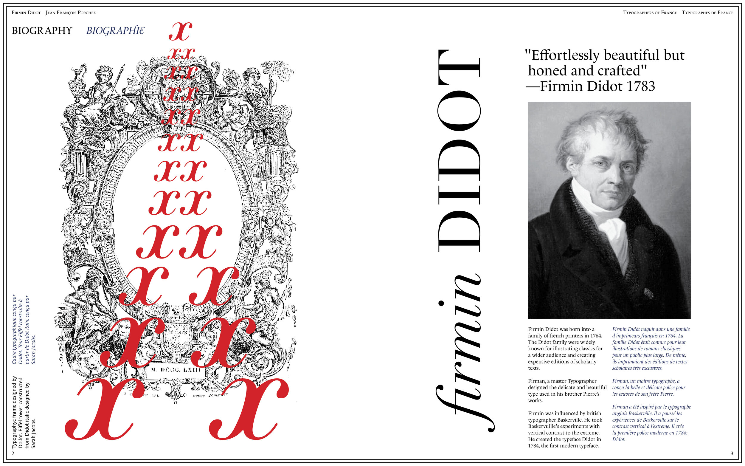
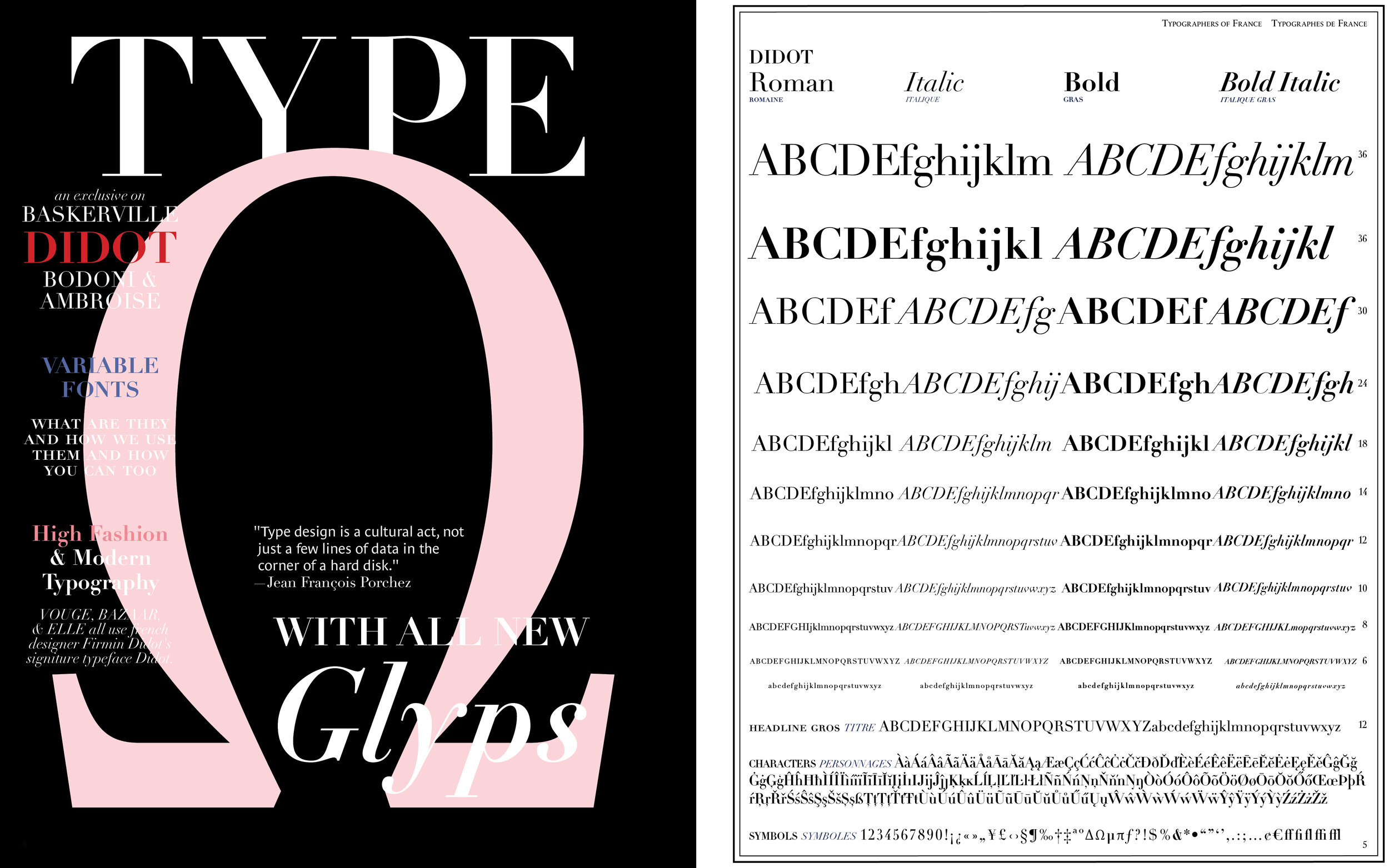
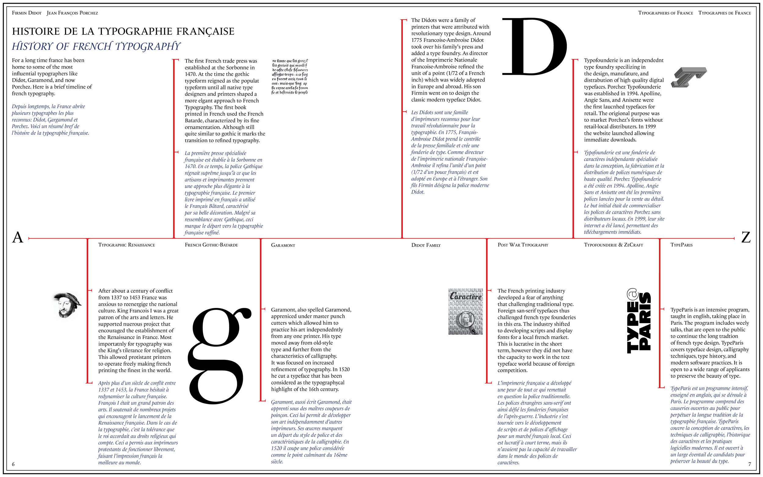
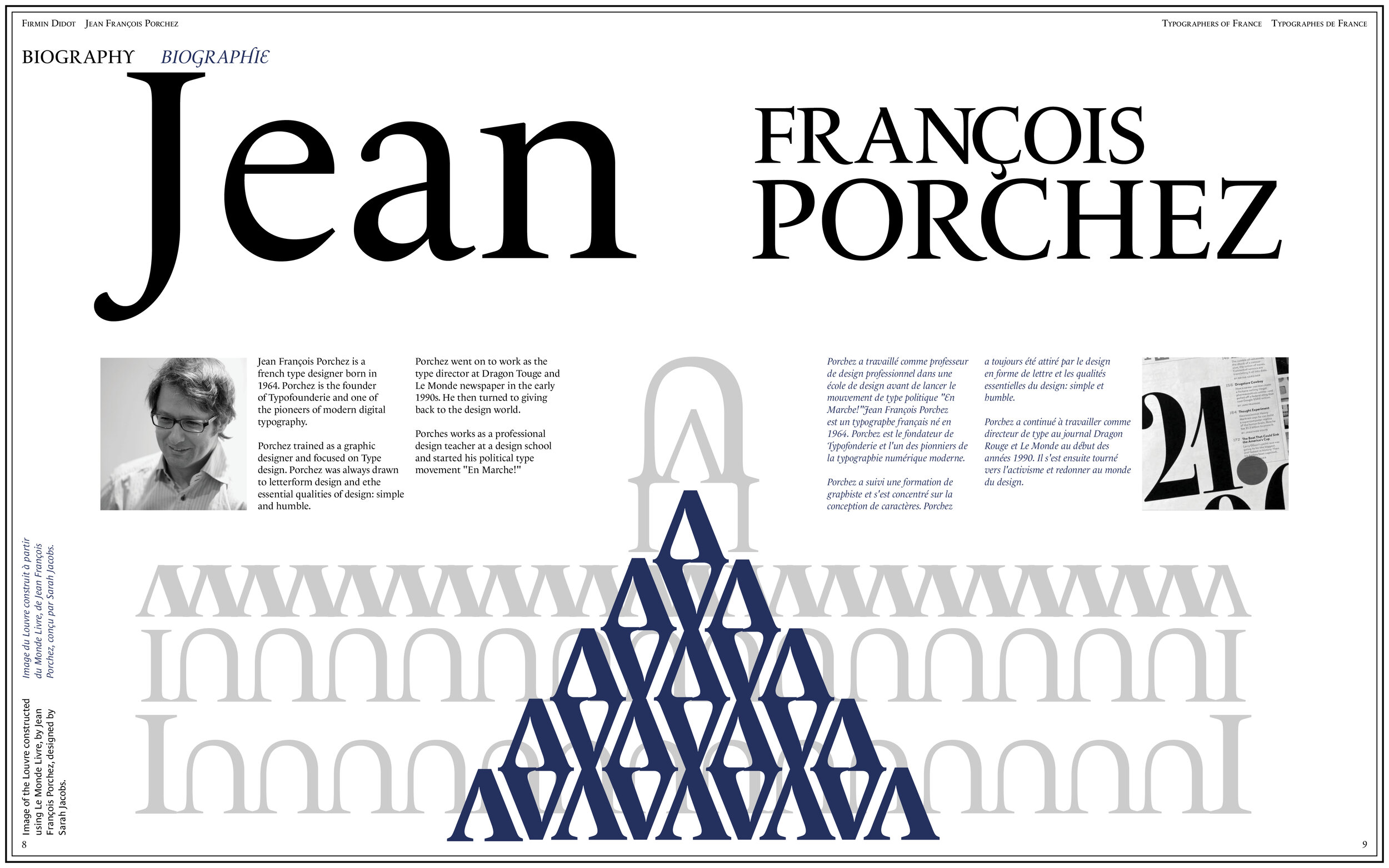
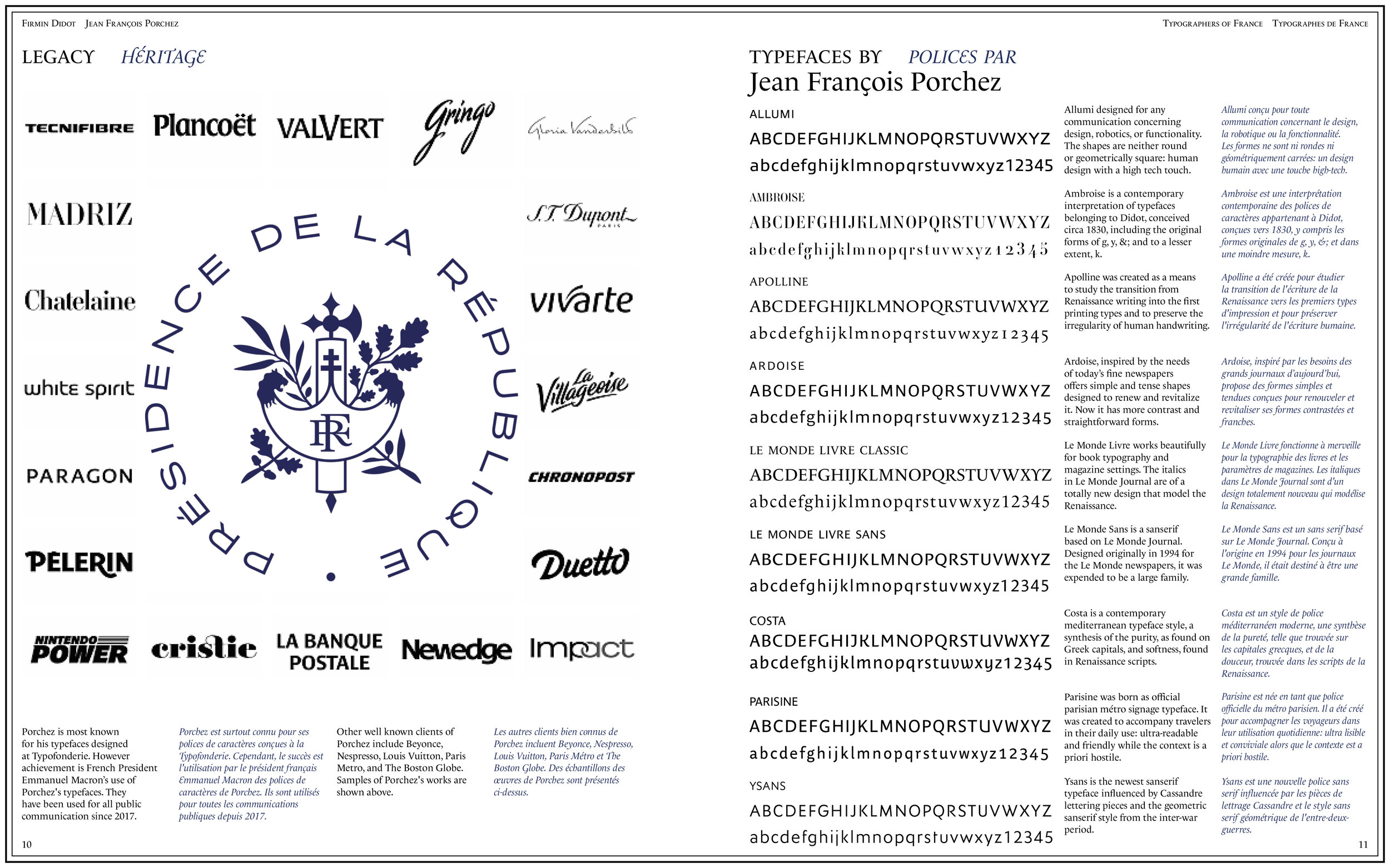
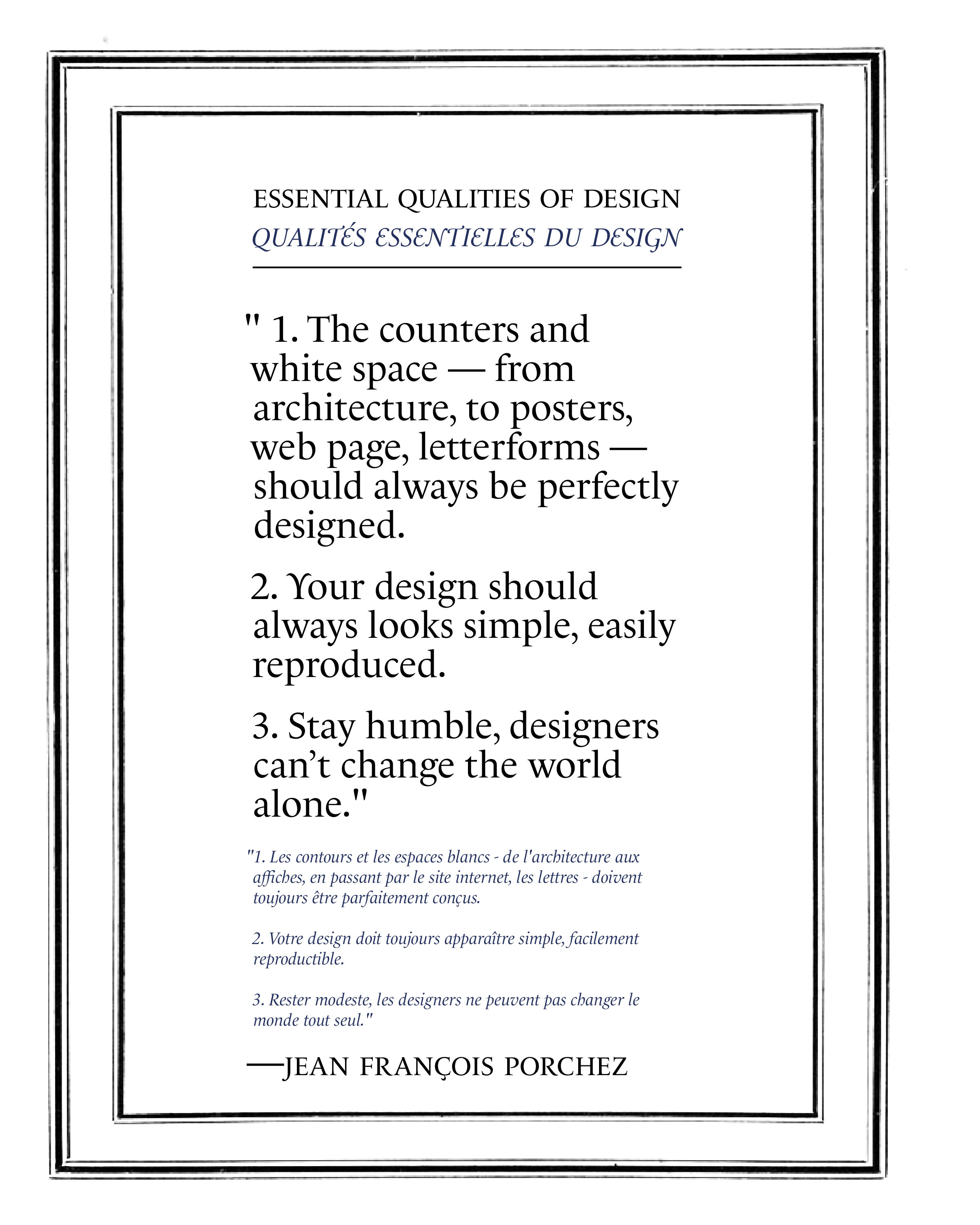
After a semester of work manipulating type we began our final projects. We each chose one contemporary and one modern typographer to highlight in a publication. I purposefully chose two french typographers Firmin Didot and Jean François Porchez and made my publication about the history and influence of french typography.
At the end of the semester I was very happy with all of the work I finished in Typography and I am even more excited for Typography 2 next semester.