Graphic Design I
This last semester in addition to Typography 1 I also took Graphic Design 1 at Northeastern University. As a Communications and Graphic and Information Design major Graphic Design 1 is a required course. I have been doing graphic design since high school thus I was excited to learn the principles and develop my technical skills.
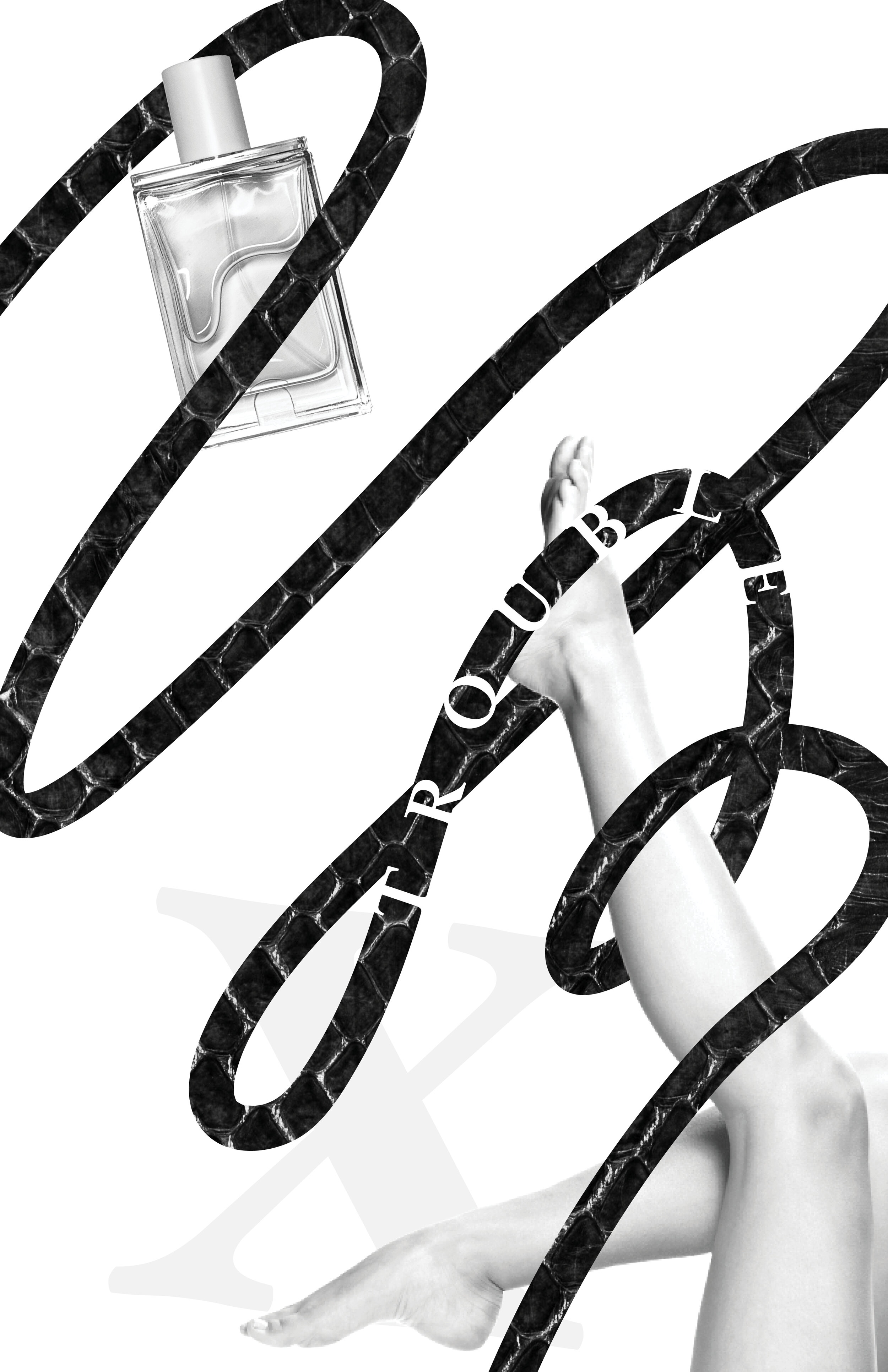
The syllabus outlined four major projects we would refine thought the semester through critique.The first project was hierarchies in which each week we would turn in a series of compositions containing elements that were supposed to be read in specific orders.The culmination was four 11x17 pages each with an object, line, letter, texture, and word.
This assignment taught me to be intensional about my placement and manipulation of elements as well as how to defend my decisions. The next project was to use a similar layering of elements to create a self portrait. I do not like self portraits because A. I do not staring at my face and B. I never know what side of myself to present. I took what I do not like about creating self portraits and created a self portrait to reflect just that.
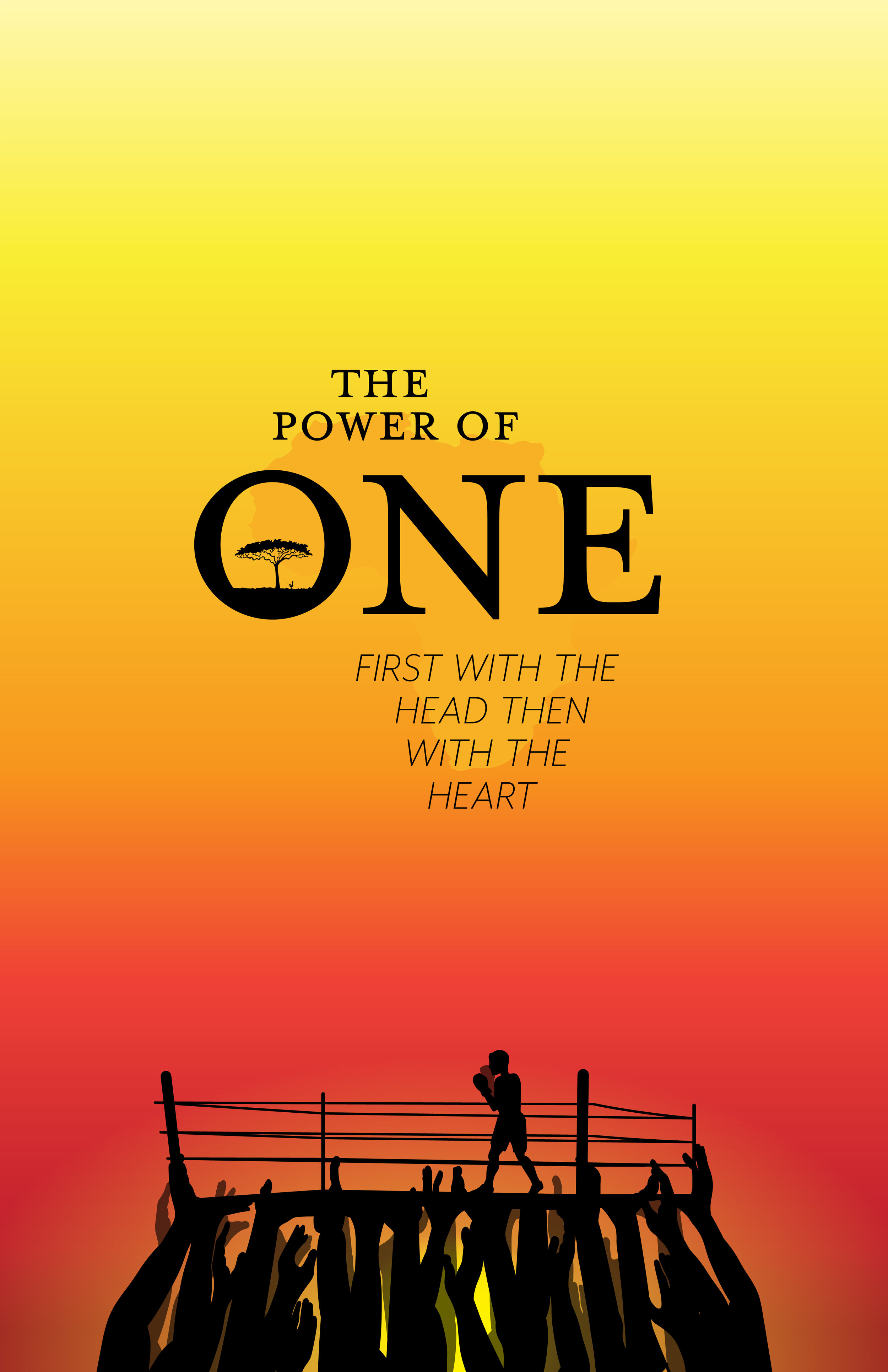
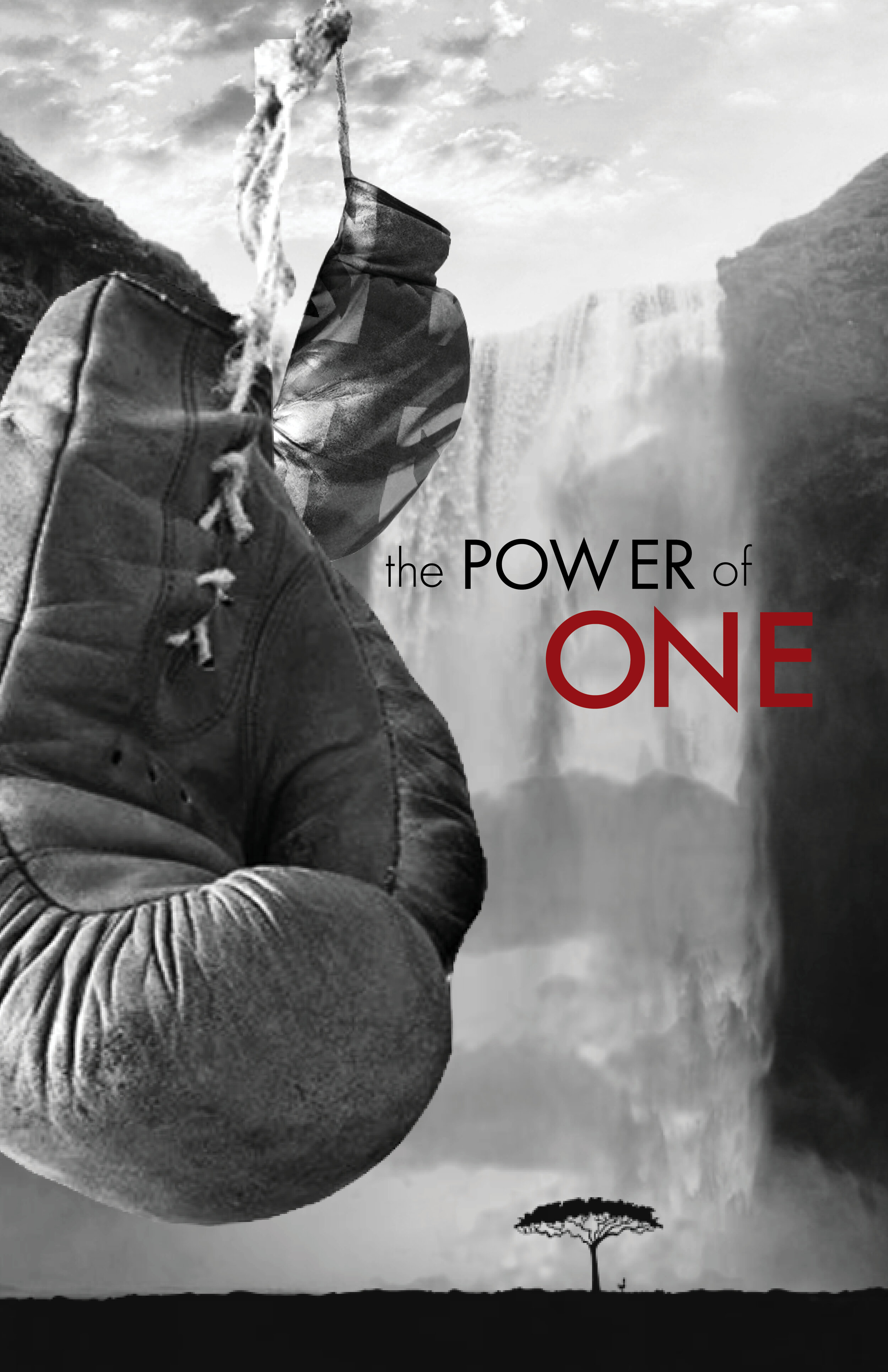
In the end I was quite pleased with how my self portrait turned out and best of all I had fun creating it. However, my struggles began in the next project.The third assignment was the concept poster. The task was to visually represent a book, opera, play, or other story. I chose the novel "The Power of One" which is an incredible coming of age story about a boxer in South Africa during Apartheid. I did not like my first couple sketches because I felt like the did not tell the heart of the story, rather they depicted the surface of trouble and darkness. After a couple weeks of struggle I changed the direction to a graphic representation.I loved the way it turned out, I felt it was deep and light and powerful, however my professor hated it. I returned to my original sketches and tried to convey the same feelings in a way that my professor liked better.
In the end I was not disappointed with the final product. However, as an illustrator I am still partial to the "flattened tequila sunrise" version. Another struggle with this project was that I fell behind on the final project because I spent so much extra time doing, redoing, then reredoing the concept poster.
The final project for Graphic Design 1 was a branding project. We all were to come up with an idea for a business then brand it with a name, tagline, and logo. My original idea was to create an environmental activist group focusing on food security, an issue that I care deeply about. However, my professor wanted to have a concrete and unique marketable thing, and mine was not. I evolved my idea several times to try to make it more concrete. Because I had to continue to change the idea I could not start on the actual branding work, putting me behind. In about week 3 of this assignment I had gotten no where in branding and somehow my idea had evolved to a chain of produce stores in food deserts that would be supplied by local farms, something desperately needed, but not my idea. My professor wanted me to do a project about a weekly farmers market type thing in the parking lots of churches. This is when I knew I had to make a big decision.
The project I was passionate about was no longer what I was working on. I had three options: do the project I wanted to do that my professor hated, do the project that I did not believe in that my professor suggested, or completely start over.
My final Graphic Design project is a brand called Lollygang, a community app for roller skaters to connect, share, roll. (More in Design.)
The version shown above and the version of the Lollygang branding I turned in are slightly different. My professor did not like the logo above but chose to display the version I prefer because in the end this is my work.
Graphic Design was not an easy class for me, not because of the workload or technical skills or knowledge required, it was difficult because I had to chose between grades and pride in my work. In the end I am confident in my work and have a lot of practice in defending it.
